Barely a day goes by without Google running some new UI test or another in one of its core products, and today's example is a nifty new sidebar that's appearing in Google Search on desktop. The first example of this was pointed out to us as far back as September, but only now is it starting to roll out more widely.
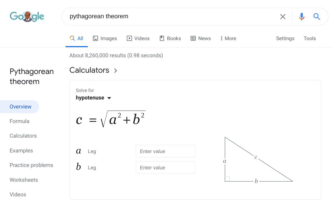
As you can see above, the new feature adds a set of vertical tabs in the previously vacant white space to the left of search results for certain queries. The default tab is "Overview" and then there are others such examples or videos, depending on what you're searching for. If it's something educational like mathematical theory, it may show tabs with worksheets and practice problems for you to delve into. If it's related to a music artist, you might see tabs such as "Songs" or "Reviews." Check out the tweet from our old friend Ron Amadeo below for an example of what that looks like.
While doing some digging Rita has discovered that your region plays a part in what you see right now. When connected to a VPN that places her in the US, she gets additional options that don't show up when Google knows she's in Lebanon. I get the same limited set of tab options here in the UK too. From our testing here in Europe and Lebanon, we can only trigger the new sidebar for searches about maths and science, but we know Ryne in the US has seen it for a music query like Ron, and movie-related terms are also bringing it up.
US users (left) get more options at present.
As well as the query title and the new handy tabs, the share button for these searches has also been moved over into this left side panel. Other cards such as "About" and related images remain on the right of the search results, however. It's not yet clear how widespread this new Google UI is, but it appears to be rolling out to more people than previously had access to it. Whether it will be used for all searches in the future or stay exclusive only to certain terms is also a mystery right now. We'll keep an eye on it.
Thanks: Sravan