Read update
- Google explains
Google’s Workplace rebranding came along with icon facelifts for a bunch of its core services, giving them a more uniform but horridly colorful icon set, and mildly sparing just a few. Our biggest gripe with the new-found consistency was that it made it harder to distinguish between the apps with a quick glance. It looks like our woes are going to aggravate further as the Indian version of Google Pay is getting a similar treatment, and this time it’s worse.
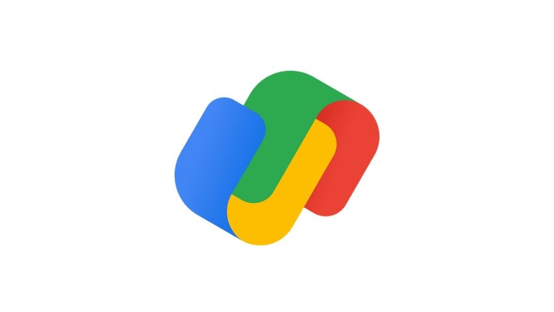
From the app icon to the splash screen, everything now dons this new logo, replacing the old GPay branding. The icon consists of two interlocked U-shaped objects that use Google’s distinct four-color palette. It isn’t quite clear, though, as to what that figure actually is — perhaps a wallet or a pair of banknotes. Google could also be trying to cleverly create the letter G (or even P, somehow), but you never know.
An app icon should ideally illustrate that app’s functionality outright, but this new Google Pay logo fails that test, or at least makes it hard to decipher the shape, defying its very purpose. However gaudy the new Workplace icons are, they at least stick to the original outline (like Gmail and Drive) or use more recognizable iconography (like Meet).
Let's play a game...
Other than the new icon, the payment app will now simply be called GPay, instead of the full Google Pay app label. This shouldn’t be a big deal since Google’s been using the GPay branding in certain places for a while.
These changes are going live with Google Pay’s beta app that recently got the flutter rewrite. You can join the official beta from the Play Store or pull the app v116.1.9 (beta) from APK Mirror to see them for yourself. Since we’re expecting the new flutter version of Tez to replace the international Google Pay app sometime next year, the new logo should eventually reach everyone following a beta round here in India.
UPDATE: 2020/11/09 8:06am PST BY KARANDEEP SINGH
Google explains
Google Pay’s cryptic new icon left us scratching our heads, trying to figure out what it actually meant. A brief explanation from Google India’s Caesar Sengupta finally clears the air with an official backstory that inspired this change: The two interlocking shapes are supposed to depict a physical wallet — something Google Pay has been trying to virtually replace for years now, supporting more and more of the cards we carry around. While that clarification does give us closure, it still fails to address how the new design is such a departure from the current one.
Most average users I showed this logo thought it was forming some kind of "link" and could not associate it with a recognized app like Google Pay — though it being some kind of Google product was abundantly clear. That certainly seems like evidence enough that the new logo could be more inscrutable than Google was aiming for. On the other end, too, merchants will have to yet again replace existing branding, which just took the place of Google Wallet and Android Pay signs, as noted by a Twitter user (below).
Thanks: prajjwal porwal, Anthony Maki

