Tired of the awful Chrome OS media controls wasting your precious notification space?
I think you'll agree that the Chrome OS notification area needs work. The media controls in Chrome OS take a large amount of vertical space in the notification area and push critical information like calendar reminders off to the side. I was honestly pretty stoked when Google merged media controls in the notification area in 2019. I no longer needed to rummage through my Chrome tabs and apps to pause whatever media was playing in the background, which was super annoying (the "pause" button on the keyboard didn't work at the time). Although Google added a few improvements to the notification tray (such as introducing a "Clear all" button to dismiss notifications), the Chrome OS notification experience is still a significant sore point that desperately needs a revamp.
The problem
The old media controls cover my important Gmail and Chrome notifications. They also look unpolished.
As it is now, the media controls can fill up your entire notification area, which often get in your way instead of helping you view your notifications. They often hide your critical notifications, forcing you to either dismiss it or scroll to see your essential email or calendar reminders. The media controls also have a weird Windows 95 aesthetic with white borders and an ugly close button. Overall, it offers a terrible media experience that looks and feels unpolished. The developers at Google finally decided to do something about it, and in the latest Chrome OS Dev channel, we have an early preview of their work.
The fix
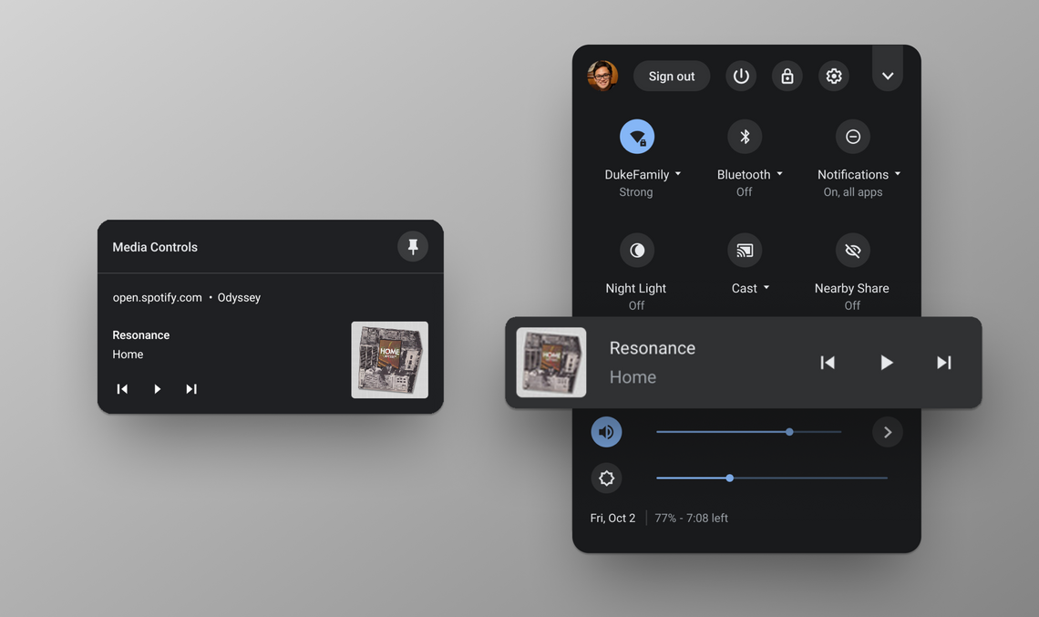
Google is experimenting with a new media control system that it internally calls "CrOS GMC," or Chrome OS global media controls. This feature aims to decouple the media controls from the notification tray and place them in the quick settings to keep more of your critical notifications in view. Here's what it looks like:
The new Chrome OS global media controls move the media notifications into the quick settings.
As you can see, the media controls no longer flood the notification area and instead are tucked neatly inside a media card below the quick setting toggles. When you click on it, the shelf will show an overview of the active media playing on your Chromebook. You can seek (fast forward or reverse), pause and play, or dismiss the media controls. You can also choose to pin your active media to the shelf to keep it a click away. Selecting the media controls restores whatever Chrome tabs and apps are playing audio.
I believe media controls should've been in the quick settings from the start. Although I understand the UX decision to keep media controls always in view, sticking them in the notification area is an awful idea. Just like Android 11's media controls, Chrome OS global media controls look nicely integrated into the system and feel a lot more polished than the half-baked experience we have today.
Chrome OS global media controls have some ways to go before rolling out to the Chrome OS Stable and Beta channel. If you're on the Chrome OS Dev channel and want to save your precious notification space, you can try out this experimental feature now by copying and pasting chrome://flags/#global-media-controls-for-chromeos into the URL bar and enabling it from the drop-down menu.
Overall, global media controls are a huge step in the right direction. I'm sure everyone will love the feature when it rolls out in a future build, and I'm happy that Google is doing something to fix Chrome OS notification issues.