It's no secret that the file manager on Chrome OS has been a sore point for users ever since Chromebooks were first introduced to the world as cloud-centric computers. It seems like Google hastily threw in a file browser at the last moment and expected only a few people to use it. Although development on the built-in file manager has stagnated over the years, Google recently introduced small quality-of-life features to make it more efficient (like finally adding "Open File Location" to the context menu). It now looks like Google is trying to improve productivity even further by cleaning up clutter from the navigation pane.
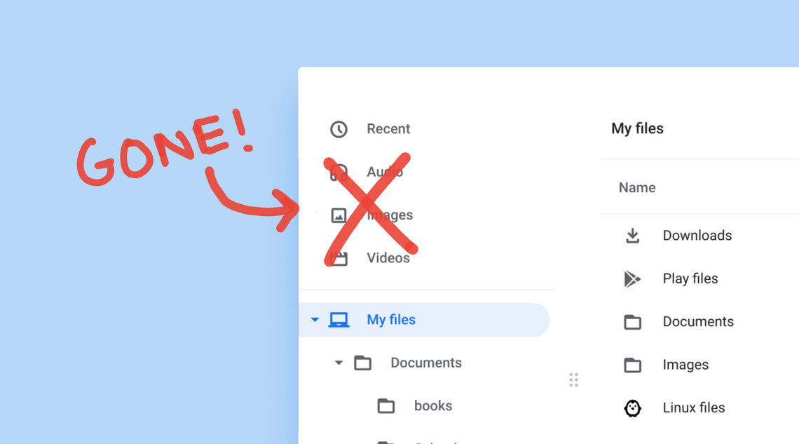
Spotted on the latest Chrome OS Dev channel, Google is working on decoupling the Audio, Images, and Videos categories away from the navigation pane and merge them into the Recent category as file-type filters. To try this experimental feature yourself, copy and paste chrome://flags/#files-filters-in-recents into Chrome's URL bar and enable it from the drop-down menu. After you restart your Chromebook and launch the file manager, you'll see a different navigation pane. Here's a look:
Audio, Images, and Videos categories are now file-type filters
The first thing you'll probably notice is the omission of the Audio, Images, and Videos categories from the navigation pane. If you click on the Recent category, you'll see that these three now function as file-type filters. As you probably guessed, clicking on any of them will show the respective files recently downloaded on your Chromebook.
I'm not sure if I like the idea of turning these media categories into filters. When I reviewed Holding Space last week, I talked about why saving clicks is vital for efficiently getting tasks done. Holding Space is a game-changer because of how many opportunities it offers to reduce clicks and boost your overall productivity. In comparison, nested filters feel like a step backward because they introduce another click. If I want to see an image I recently downloaded, I have to go to the Recent category first, then click the Image filter.
Despite the productivity shortcomings, I understand why the UX team at Google proposed nesting file-type filters under Recent. As a student who is continually creating folders and downloading files, my navigation pane is a mess. Merging media categories into recently accessed files adds extra room to the navigation pane, allowing me to see more folders in a specific directory. Fewer categories can also lower visual noise from the navigation pane, which helps improve focus.
To accommodate both worlds — keeping recent file types a click away versus cleaning up the navigation pane — I believe Google should experiment with a drop-down arrow to the Recent category. I designed a mock-up that imagines what it could look like.
Mock-up of the file manager's navigation pane using a drop-down arrow for Recent
Similar to the "My files" and "Google Drive" sections, the drop-down arrow would allow "Recent" to collapse or expand depending on user preference. By default, it should be expanded, but if the user wants to save space, they could collapse it to hide the recent media categories.
I'm happy Google is finally putting effort into making its once-neglected file manager more capable than ever. Google still has a lot more work to do to catch up with competing file browsers like Windows Explorer, but even the smallest actions like tweaking the navigation pane are steps in the right direction.