Let's be honest with ourselves: push notifications suck. It's incredibly annoying when you are spammed information that isn't relevant to you. As irritating as it is, notifications are fundamental to a product's usability and necessary for a good user experience (when done right). To increase engagement, designers came up with notification badges, a subtle way to hint that something is waiting inside the app. Google eventually adopted this concept with Android Oreo using notification dots, and it looks like Google wants to bring notification dots to apps on your Chromebook as well.
Spotted in the latest Chrome OS Dev channel, Google is working to bring Android's colorful notification dots to apps on your Chromebook. When you receive a new notification, you'll see a little colored circle superimposed over the shelf app icons and launcher apps. Here's a quick look:
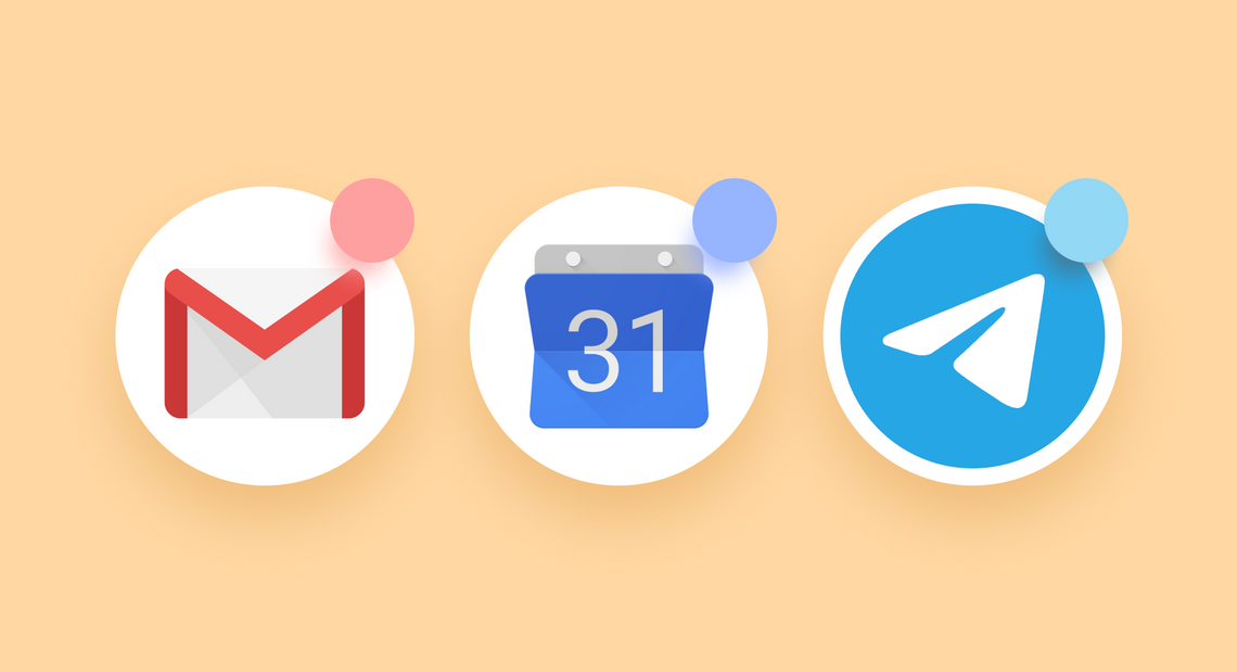
Notification dots in the launcher and shelf
Unlike the previous versions of Chrome OS, I can easily see which apps have active notifications in the launcher and shelf. Notification dots placed on the top right of icons (and using a color based on the app icon's accent colors) mark several unread messages from Gmail, Telegram, and Discord in the screenshot above. If those prove too distracting, you can turn them off with the Do Not Disturb quick setting toggle. Long-pressing or right-clicking the app icons doesn't reveal the content of notifications, as it does on Android — that's a bummer, but I imagine it could be something Google might implement in the future.
You might be wondering why adding small details like notification dots on app icons matters for Chrome OS. Notification badges (and dots) encourages impulse engagement by making apps feel active. A study from the American Marketing Association explains that just their sight on social apps can trigger dopamine releases because of social awards designed to hook people (like upvotes and comments). Even a simple notification badge implementation boosted Duolingo's growth by 6%. Unlike push notifications, they help users focus on their primary tasks while reminding them that an app wants their attention.
I find notification dots to be handy for sorting notifications in my workflow. My notification tray on my Chromebook is usually filled with spam from various apps, and it's overwhelming to scroll through stuff that isn't important. With notification dots, I can easily see at a glance which apps have notifications so I can prioritize those I launch directly from the shelf without having to dig through which apps want my attention.
I'm pretty happy that Google is bringing notification dots to apps on Chromebooks. It's a small quality-of-life feature that goes a long way to make apps feel active and dynamic and is proof that Google is trying its best to refine the Chrome OS experience.