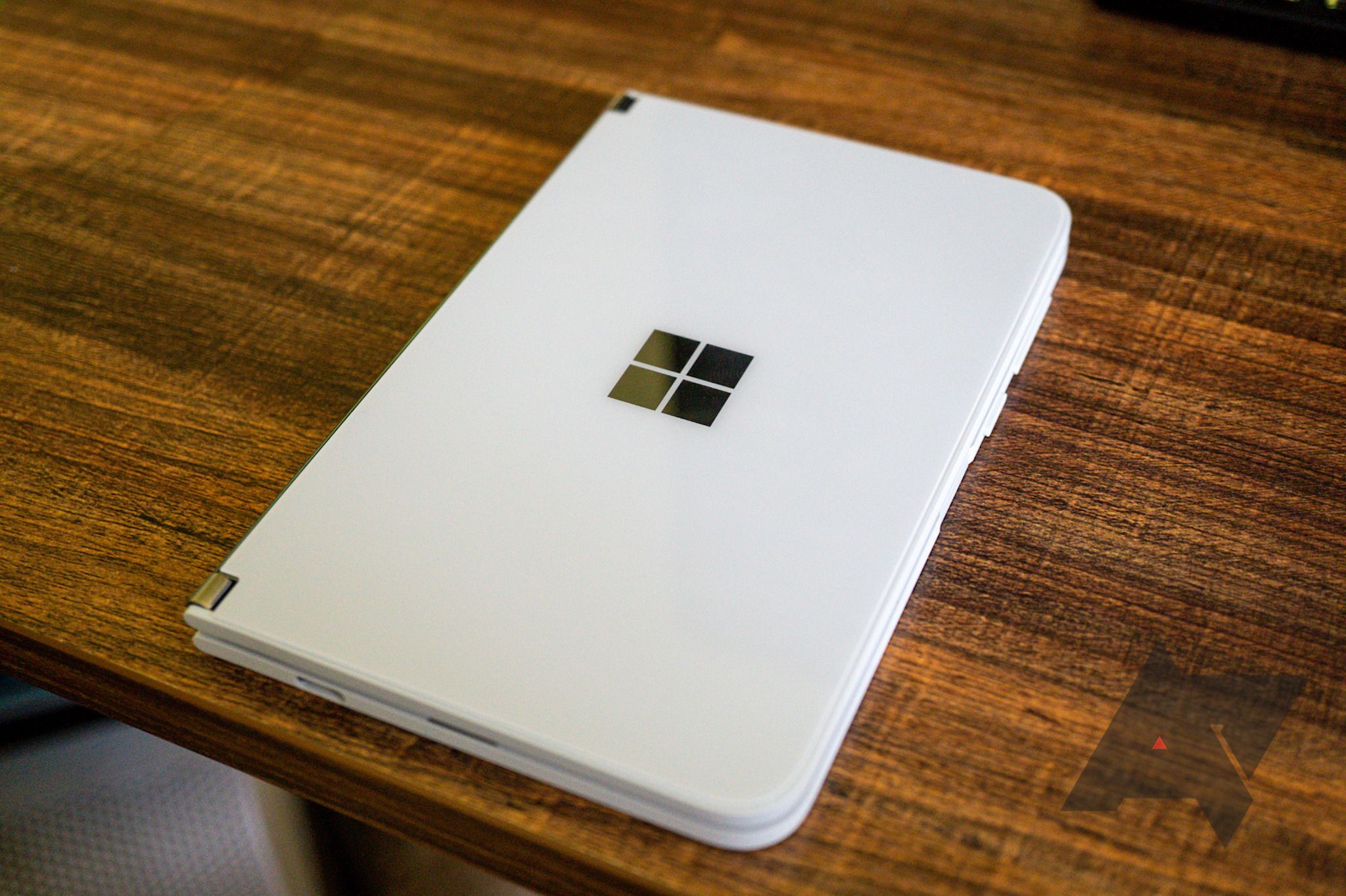
It's been almost a year since Microsoft first teased the Surface Duo, and we've been waiting to get our hands on one ever since. Our review unit arrived a few days ago, and given the excitement around it, we thought we would show you what it looks like in person ahead of our full review. While the unboxing isn't exactly anything groundbreaking, just holding the Duo in your hands makes you realize Microsoft's built something special here, something legitimately new and different. In other words: the Surface Duo is really cool.
The retail packaging isn't incredibly exciting, but it is just a box after all. Once you take the Duo out, all that's left is a SIM card ejector, a USB charging brick, and a USB Type-C-to-C cable. There's no 3.5mm adapter or included headphones, so if you want to use wired audio, you'll have to bring your own dongle.
The only unusual item in the box (besides the phone) is the included bumper 'case,' which is less of a case and more just strips of rubber that stick to the sides. It's definitely intended to stay on for as long as you need it to — Microsoft even included a hole for the SIM card tray. The bumper case adds very little bulk to the device.
Moving onto the phone itself, the Surface Duo is completely unlike any phone I've ever held before. Part of that is the width of the device — at 93.3mm across, it's significantly wider than most of the 18:9 phones I've used recently. The curved ends matched with the hard angles on the hinge's side add to the phone's unique feel. Speaking of the hinge, the Duo does take a bit of force to open, but not so much that I feel like something is going to snap.
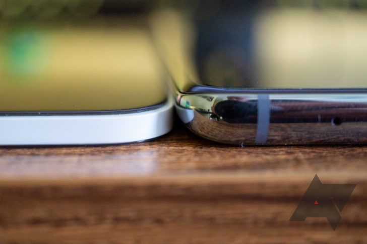
The most striking aspect of the Surface Duo is just how thin it is. It's only 4.8mm thick when open, and 9.9mm when closed. For comparison, the Galaxy S20 Ultra is 8.8mm thick, and it only has one screen. It even feels tiny compared to the regular Galaxy S20 I use every day. There's barely enough room for the USB Type-C connector on the bottom.
The Surface Duo (left) and Galaxy S20 (right)
The side of the device also has a few interesting design choices. The buttons are incredibly thin, because they have to be, but they still feel clicky with great feedback. Below the volume and power controls is a side-mounted fingerprint sensor, similar to the one on the Galaxy S10e or some older Sony phones. The SIM card tray is positioned just below the sensor.
Stay tuned for our full review, where we'll share our long-term impressions and thoughts about the software experience.


