For almost as long as we can remember, Google Groups has paid almost zero attention to its interface. Things turned around for the desktop version of the service back in March when it got its first design refresh in years, but the mobile site was still left stuck with an even older and more dated UI. That’s going to change pretty soon, as the company has announced a Material Design treatment for Google Groups in mobile browsers, bringing it on par with many of its mainstream web apps.
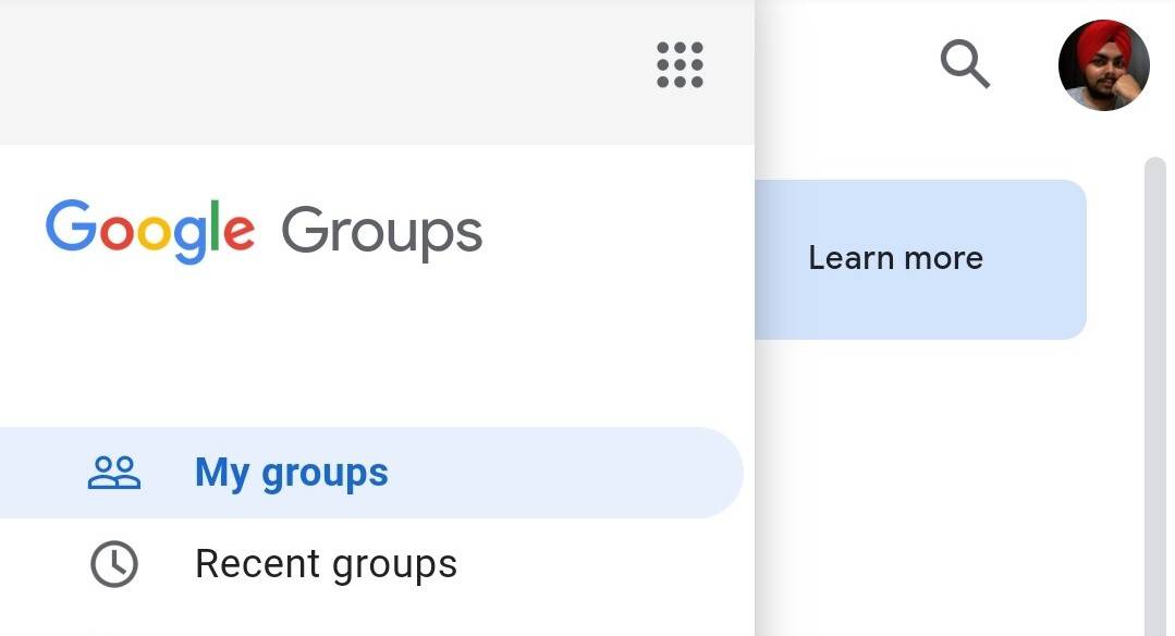
In the included screenshot (below left), you can see the archaic layout of Google Groups’ mobile site with a generic blue header. Nearly all Google sites donned a similar look back in the day, including Gmail, but most of them moved on to adopt newer visual elements, and Groups, unfortunately, didn't keep up. The redesigned site brings a much cleaner and modern interface to the table, complete with the Google Sans font, hamburger menu, and the now ubiquitous account switcher.
Left: (Very) old design. Right: New interface.
Google says that it has made it easier to find your groups, manage your memberships, and read conversation within groups. However, you’ll have to switch to the desktop version for certain "group interactions," like if you want to post or reply in a group.
This Material design refresh is coming to both G Suite and personal account holders. Google estimates to finish the rollout by around the end of this month. If you’d like to try out the changes right away, you might be able to, though the steps to do it don't always work in our testing. First, switch to the desktop interface when on the mobile site, then click on the option to try out the new look. That can take you to the refreshed mobile site, though it doesn't always work for us, and even if it does, you’ll have to repeat the first step on each visit until the refresh reaches you officially.
Source: Google