There's a lot that Spotify can improve in its app's experience, but the most glaring issue for anyone using a larger-screened Android device was the lack of any interface optimization. The phone UI simply stretched to fill the screen, with tiny touch targets and no special consideration given to the larger screen estate. That's changed now as Spotify began rolling out a new tablet-optimized design on Android.
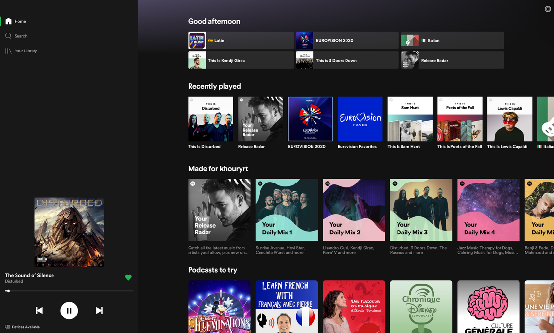
The new look is a carbon copy of the one that showed up on iPad ten months ago. Complaints of lateness aside, it's a step in the right direction. While the UI on Android tablets and Chromebooks was nothing but an expanded one from phones, with tabs and a tiny now-playing bar on the bottom, the new one moves those to the left and pins them. You get larger album art, always-on rewind and skip buttons, and access to Spotify Connect to quickly switch output to nearby speakers or devices. You can see the before and after in the two screenshots below.
Top: Old. Bottom: New.
That left menu stays put while you're checking your home page, searching, or browsing through your library. The only time it goes away is when you expand the now playing screen.
Touch targets and fonts are still tiny, especially on Chromebooks with high-resolution displays — as shown in the screenshot at the top of the post, which was taken on my Pixelbook. But at least we're taking a step in the right direction.
We're not sure if the interface is rolling out server-side or not. On my end, it showed up today on v8.5.72.287 on my Pixelbook and v8.5.72.625 on my tablet. Just make sure you're on the latest version of the app, or join the beta, and you'll probably have it soon.