Android's emoji set has never been the consistent, culturally accepted staple that Apple's is. For a long time, users of stock Android enjoyed a fun, expressive collection of blobs. Google refined them to be more visually consistent in 2016's release of Android Nougat, only to completely get rid of the blobs the next year. Now, Google is giving its Noto Emoji their biggest visual change since the blobs melted.
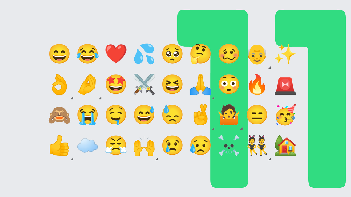
Though support for the new emoji came to Gboard last month, the smiley faces' new look arrived with the Android 11 Beta 3 release today. Gone are the bold outlines and deep blue tears, replaced by murky gradients and less distinctive accent colors. They look a lot like Samsung's set of emoji actually — and since Samsung is the largest purveyor of Android devices, that probably isn't a coincidence.
While Google is always adding support for the new emoji approved each year by the Unicode Consortium, I had thought the company had reached a place of stability when it came to the overall look. I liked the blobs, and I liked their cute successors, too. But while I was fine with that change, the Android 11 redesign seems like a step back in terms of aesthetics to me. It's hard to quantify it in words, but the new emoji feel a bit less Google-y.
The partying face looks awkwardly small next to its new counterparts.
The company hasn't really gone into specifics behind the visual changes to the smileys, although it did send out a press release touting the return of Android Nougat's adorable turtle, among other friendlier looking designs for some critters. Hopefully we'll get more insight into the thinking behind the latest refresh as we get closer to the public release of Android 11 next month.
Thanks: Nick Cipriani