Read update
- Slack revealed in a blog post that the interface is now going live for everyone on both iOS and Android. "This update introduces improved navigation, quick access to set your availability and status on the go, an easy-to-reach compose experience, and shortcuts to your apps and workflows," the company said.
Slack is silently testing a new interface in the latest beta version of the app for Android. Though the changelog for the release doesn't mention it, the UI has received a serious overhaul, with an iOS-style bottom navigation bar replacing the old side slide-out one in what the company calls a "simpler, more organized Slack."
Left: Old slide-out navigation menu. Right: New bottom navigation menu.
The biggest visual change is the navigation bar, which, unfortunately, isn't pervasive throughout the entire app in the current test. The Home section, which is essentially your channel/DM navigation screen, gets its own tab, rather than living in the slide-out menu, as it used to. Given how hard it is to trigger sliding navigation menus with Android's new gesture navigation system, changes like these were bound to happen, but the fact that the bar is only present in the "middle" sliding section is a little inconvenient, more on that later.
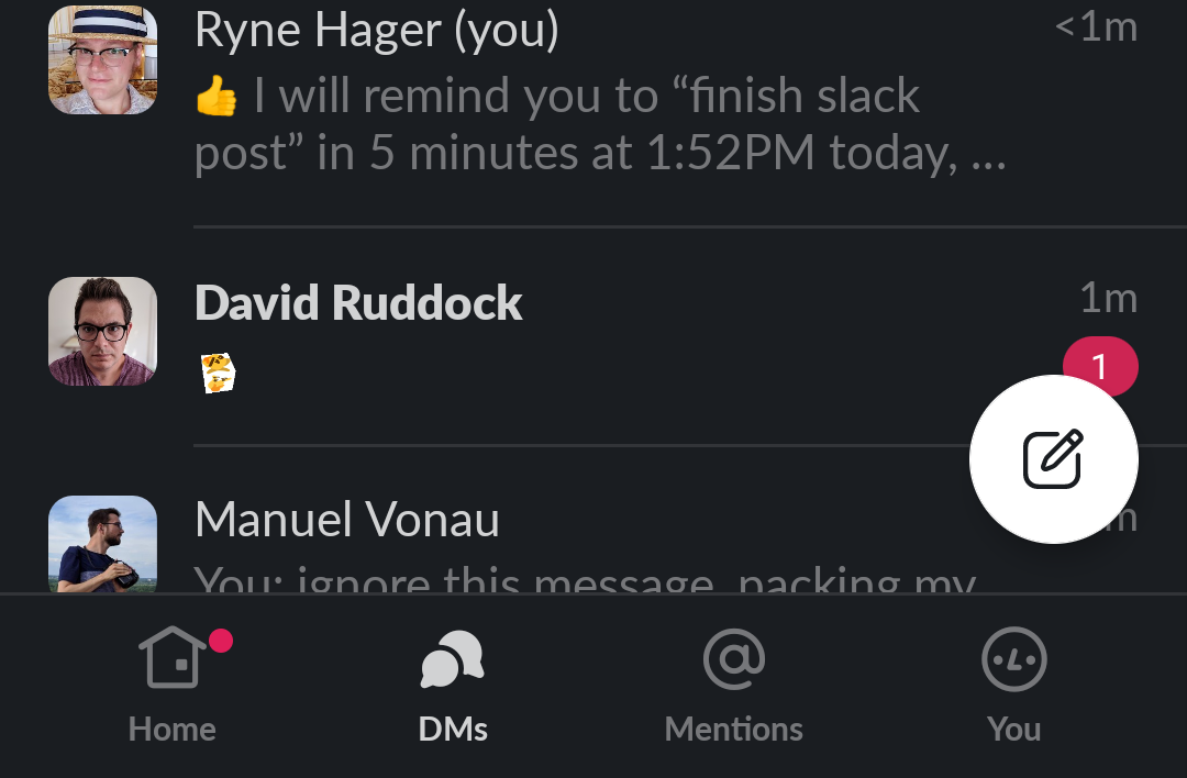
Inside Home, starred channels have now been given priority over unread channels. Starting a DM has also been relocated to a floating action button, present in Home, DMs and Mentions tabs. Although there's still a plus sign on the same line as the "direct messages" category, it no longer does anything in the current beta — probably a sign we'll see further changes to this interface in time.
Left: DMs as they appear in the slide-out navigation menu. Right: New DM tab.
The new DMs (direct messages) tab is a little redundant with the DM list in the Home tab, listing almost the same limited set of conversations in a slightly different order, but still incomplete to your total history. It does show a preview of the last message received or sent, though.
Left: Old Activity section of Slack. Right: New Mentions tab.
The new Mentions tab is more easily accessible than the old Activity section, though it's about the same in functionality, listing mentions that apply to you and categories you belong to.
From any navigation tab, sliding left takes you to your workspace browser, which lets you view and select between multiple Slack workspaces, and make new workspaces. I should note, trying to create a new workspace in this latest beta can bug out. Though it will be created successfully, attempting to navigate between a newly created workspace (which may be stuck using the old interface) and one using the new interface seems to cause the app to repeatedly and continuously crash, so be careful.
Sliding right takes you to your most recently opened conversation view — DM or channel. That right-most screen also loses the navigation bar, which can feel a little awkward in application, but it's consistent with the navigational schema Slack has structured. Still having essentially two mutually exclusive axes of navigation between sliding navigation and the new navigation bar does make the app a little less intuitive.
A couple of the "advanced" settings in the old version of the app seem to be missing in this redesign, but most of the features you uses are probably present, though they might be moved around a little, and all accessible from the right-most "You" tab.
Left: The "New Message" dialog replaces the old DM and channel search dialogs. Right: even the text entry field in a given channel is slightly tweaked.
Just your general channel view is also slightly different, with no more (frankly, redundant) channel navigation drop-down menu at the top of the screen, and a new Search Shortcuts button (the lightning bolt you see next to the emoji button). The three-dot menu is also gone, replaced with a dedicated channel info button. The search button might look a little different now, but it still works the same way.
Given a couple of small things still seem to be in transition, missing, or non-functional as of this latest beta, I wouldn't be surprised if we see further changes on these UI changes with a later update. In the meantime, you should probably start adapting to the new navigation system.
To get a head start, you can download the latest beta version of the app (v20.05.10.0-B), which silently includes this updated UI. It's available via the beta program on the Play Store, or you can manually pull it down immediately via APKMirror. You may need to restart the app one or two times to get the new interface to work, and we should note that it did bug out and crash on some workspaces, so be careful. You might have to wipe app data and log in again if that happens.
UPDATE: 2020/05/14 1:37pm PDT BY CORBIN DAVENPORT
Slack revealed in a blog post that the interface is now going live for everyone on both iOS and Android. "This update introduces improved navigation, quick access to set your availability and status on the go, an easy-to-reach compose experience, and shortcuts to your apps and workflows," the company said.
The change is server-side, but it seems to have already rolled out to everyone who has a recent version of the mobile app installed. Interestingly, tablets seem to be left on the old interface — perhaps to keep them more in line with desktop platforms.
Thanks: Hernán Castañón

