Google is tweaking the way the sharing dialog in its G Suite services will look. The change, which affects things like Google Drive, Docs, Sheets, and Slides, has a more "task-focused" interface, separating link-based sharing from targeted contact sharing. In short, it should be a bit easier to use, shows more information at a glance — like who you've shared something with and what their permissions are — and generally offers a more friendly look. (It's also much prettier.)
Above: Old interface (with link sharing enabled). Below: New interface.
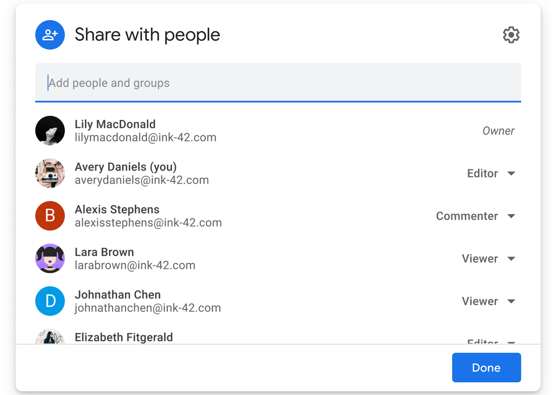
The change isn't subtle, with new iconography and link-based sharing now expanded into its own visible section by default, rather than hidden behind the "Get shareable link" button at the top. It should also be easier to get that link without changing permissions first, making link-based sharing faster.
As before, you can type names to search for contacts to share with, but the new interface shows avatars together with email addresses, and better shows who has what level of access — before you had to click their name to go to an expanded view, and it was pretty confusing, with icons denoting the level of access (a pencil for edit, for example) rather than easily understood text labels.
This change is starting to roll out beginning today, though you might not see it for another month or so, depending. While the change affects all G Suite, Enterprise, and even basic/personal Google Accounts, Google's rolling it out at different paces depending.
Source: Google