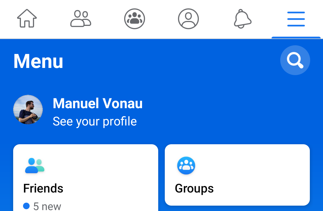
Along with many other developers, Facebook got rid of colors in its app and moved to an all-white theme. It looks like the company isn't satisfied with that decision anymore, as the menu in the app's rightmost tab has received a facelift (if you want to call it that) that switches out the white background of old for a blue gradient. While at it, Facebook has also rearranged the menu items and now displays them as bubbles in a two-column interface.
Left: Old interface. Right: New interface.
Functionally, there isn't much of a difference between the old and the new menu. You still have access to all kinds of Facebook sections and the app settings and privacy preferences through it. Due to the rearranged bubbles, it becomes harder to parse the menu, though. The old white design also didn't look like a game as much as the new one does and better matched the rest of the app, but that's just my two cents.
Many people have reported and complained about the change on Twitter over the last few days, so we can assume that this is a wide rollout. If you don't have it just yet, it will probably soon show up for you, whether you like it or not. At least it still looks better than an earlier test that went for a blue-lilac gradient and a big Facebook button in a new bottom bar. Meanwhile, a dark theme option is still under development and not available to all.
Thanks: Frank, Gurkanwal, Quinn

