If you feel pretty strongly about a business, you might head to some place like Yelp to express your thoughts. But if you haven't been using its Android app lately, we can get why: it's cramped, has too many tabs to dip into, and even retains a few elements from Android's old Holo era. Well, we've been tracking a design overhaul that Yelp has been slowly dosing out and is meant to remedy all of those faults.
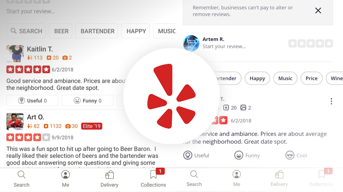
Left: Old Place screen / Right: New Place screen
The redesign process has been rolling out to users drip by drip and not all at once. On one front, the header band has switched from Yelp's signature red to a plain, bright white. The Place screen has been revamped to spotlight images and spread out the UI to make it more readable for browsers. Oh, and users can now swipe between single reviews.
Android Police founder Artem Russakovskii saw them while he was on beta version 19.45, but we have seen a few of the above elements roll out on stable v19.45 as well. Each of these elements has not come at the same time as others, so we'll call this an uneven deployment. It'll also be a while yet before we see the new look fully unwrapped, but overall, the changes are years overdue — the dinosaur Easter egg is still there — and appear to be extremely welcome.
Left: Old look / Right: New look
Grab Yelp on the Play Store or check out APK Mirror.