Google Podcasts is a relatively new product, and it shows due to the lack of some features we take for granted in podcast players. The service is slowly getting there though and has recently added a desktop version and automatic downloads. Right now, Google is working on a rather minor interface change that still makes listening to podcasts a more pleasing visual experience. For some, the Now Playing screen has grown bigger and has added a three-button overflow menu with further options.
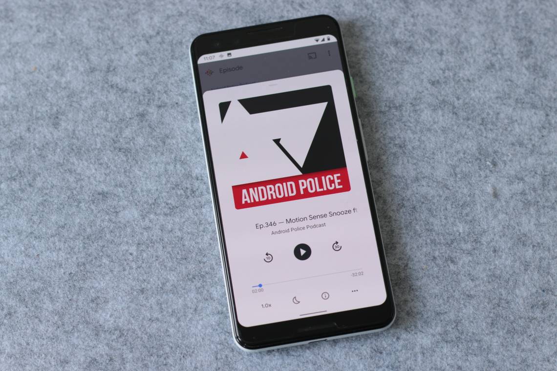
The small, grayish Now Playing interface of old with a mini thumbnail has been replaced by a much bigger version almost stretching out to the top of the screen. Its rounded corners and the extensive use of white make it a picture-perfect example of Google's current design language. The pause and rewind buttons have been rearranged to sit on top of the progress bar and a new overflow menu has been added in the bottom right corner. In it, you'll find options to share the currently playing podcast or mark it as played. The other buttons like speed, sleep timer, and info, have been pushed to the left.
Left: The old, grayish interface with a mini thumbnail. Middle and Right: The new, larger interface with rounded corners and overflow menu.
Since the podcast player is merely a website wrapped into the Google app itself, the new interface is rolling out via a server-side update. You can download Google Podcasts on the Play Store, which will give you a proper icon to tap on your homescreen, but it won't help you receive the new UI faster.
Thanks: Ramit Suri