Read update
- YouTube appears to be testing another variant of this new menu. Our main complaint about the redesign has been addressed: your library and subscriptions are on top and thus easier to access. Gaming, Music, and Latest have been moved to the bottom, while Entertainment seems to be gone. Thanks, Indefinite Implosion!
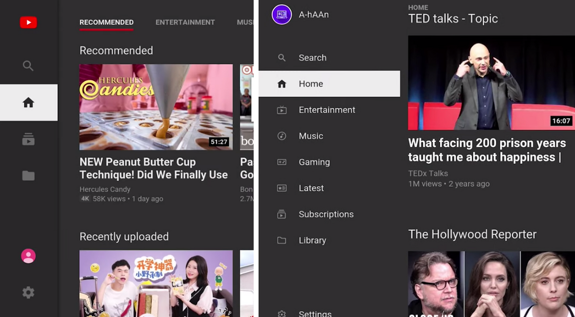
The current YouTube app for the big screen — the same one you see on Android TV, Fire TV, other smart TVs, video game consoles, and so on — has a pretty simple interface with just four main menu items (Search, Home, Subscriptions, and Library). A makeover is on the way, however, that will see the interface expanded to include a much longer menu list, which may or may not be an improvement.
A-hAAn has access to the latest update and has (aptly) outlined the changes in a YouTube video (see below). As you can see in the screenshot above, the new menu items include Entertainment, Music, Gaming, and Latest. This is great if you previously used the tabs at the top of the Home section to navigate to those, but less so if (like me) you just go straight to your subscriptions, which is now slightly further away. Another difference is that the profile image and associated Account options are being moved to the top left corner in place of the YouTube logo which is now in the top right. The settings cog remains at the bottom.
The current/old interface.
The new hotness.
You might also notice that the iconography has changed somewhat, which Google's more modern Material icons being introduced, the same as those we are seeing in other app redesigns. In contrast to the old ones, they are hollowed out when deselected. The video player doesn't appear to have changed at all, nor have the interfaces in the Subscriptions and Library sections. Some users will be overjoyed to see an 'Increase contrast' option added in the Settings which turns the dark gray background of the app pitch black — this will be great for OLED TVs. Edit: this feature has been there a while.
It's not clear whether this update is going out to just a small number of users as part of a limited test for now or if it's the start of a wider rollout (I've not got it yet), so we'll have to keep an eye out for it.
UPDATE: 2019/10/03 1:39am PDT BY RITA EL KHOURY
YouTube appears to be testing another variant of this new menu. Our main complaint about the redesign has been addressed: your library and subscriptions are on top and thus easier to access. Gaming, Music, and Latest have been moved to the bottom, while Entertainment seems to be gone. Thanks, Indefinite Implosion!
UPDATE: 2019/11/04 2:09am PST BY RITA EL KHOURY
This new menu is now rolling out widely on Android TV devices. Unfortunately, the second iteration that we saw last month hasn't stuck around, and we're getting a tab order similar to the first version, where your subscriptions are toward the bottom and require more clicks to get to.
New menu rolling out.
Source: A-hAAn
Via: 9to5Google