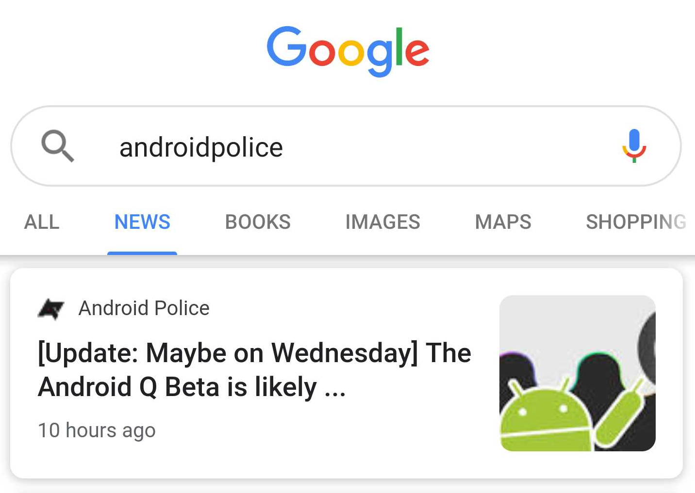
With Google, you have many ways of accessing the news. If you want to dive into a particular topic, your best bet is to use Google Search itself. Soon, you'll be able to do that in a fancier fashion in the search app and on the mobile web, as Google is working on a Material Design refresh for its news section. Our lucky tipsters got an early glance at it through the company's notorious A/B testing.
The theme of design changes is one we've become familiar with: article titles are now bolder and easier to read, and the blue and green color palette of old has been stripped to make way for a black typeface. By adding sources' thumbnails and separating them from the publishing date, search results are now easier to parse. Information density decreased through bigger rounded cards and images, but the whole design looks way tidier that way.
Note that for some users, there is a "related coverage" section beneath the first result that offers a carousel of associated news. This appears to be another A/B test, since it shows up in the old UI for my colleague Rita and me, as well. It's similar to the UX in Google News, where related coverage sometimes shows up after you exit an article.
Left: current design. Center and right: Material Design refresh
After refreshing the search app's bottom bar and settings page, this is another step towards a more coherent design language across Google Search. Unfortunately, none of us at Android Police could reproduce this new look, so it's probably a very limited test run for now.
Thanks: Samarth Verma, Gurkanwal Singh, Moshe

