Read update
- Android Q Beta 2 is now available, and the release notes include more details about the share menu:
Android's share menu has been a bit messy for years, mostly thanks to the slow-loading app-specific targets that appear at the top of the list. In fact, many apps opt to create their own interfaces for sharing, so users don't have to deal with the janky native UI. In Android Q, the default share menu is receiving a facelift, just like Google promised last year.
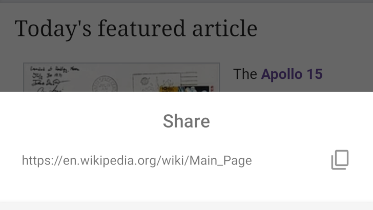
The new menu displays what exactly is being shared (at least for text/links) at the top, with a clipboard button at the top-right. Below it is the usual list of app targets (like the 'Screenshots' one for Drive in the below GIF), followed by all your apps. Overall, the design hasn't changed much.
What has changed is that Google is introducing a new 'Sharing Shortcuts' mechanism, which allows apps to set targets ahead of time. They're like launcher shortcuts, but for sharing. These new shortcuts will load instantly in the share menu.
It will probably be a while before apps switch to the new API, but it seems like Google has also improved existing share targets. I noticed they seem to load faster after the first use, so there might be a new caching mechanism.
Either way, I'm happy to see the share menu getting some love. Maybe now Google can standardize the share button's placement?
UPDATE: 2019/04/03 11:29am PDT BY CORBIN DAVENPORT
Android Q Beta 2 is now available, and the release notes include more details about the share menu:
Following on the initial Sharing Shortcuts APIs in Beta 1, you can now offer a preview of the content being shared by providing an EXTRA_TITLE extra in the Intent for the title, or by setting the Intent's ClipData for a thumbnail image. See the updated sample application for the implementation details.
Put simply, there is now a documented way to set a title and thumbnail for whatever an app wants to share.
Source: Android Developers Blog