Google's been slowly but surely updating its apps to match its new Material Theme look (sometimes called "Material Design 2," much to Google's chagrin). In some cases we've seen substantial changes, sometimes the differences are minor. Play Books is the latest first-party app to get a new coat of paint, and in this case, the tweaks are pretty small.
All of our screenshots of the updated design are in Russian, so a direct comparison requires a bit more imagination. Unfortunately, it hasn't hit any of our own devices just yet.
"Home" screen in Play Books before (left) and with the updated design (right).
The obvious changes we'd expect from an updated Material refresh are all present: iconography is now hollow, backgrounds are mostly white, and fonts have been replaced with Google/Product Sans.
The default "Home" screen looks to be getting a tweaked carousel for books in your library and a handful of new category buttons. As you'd expect, the navigation bar throughout the app is also now white.
Library tab before (left) and after (right).
Cards for individual books in the library tab have been subtly tweaked: the 3-dot menu is now at the top-right as an overlay on each book cover, giving a bit more (necessary) space to titles. Card outlines seem to be just a bit lighter, and the cards themselves appear to be smaller. The "more" button to expand sections has been swapped for an arrow, and backgrounds, icons, and fonts have been updated.
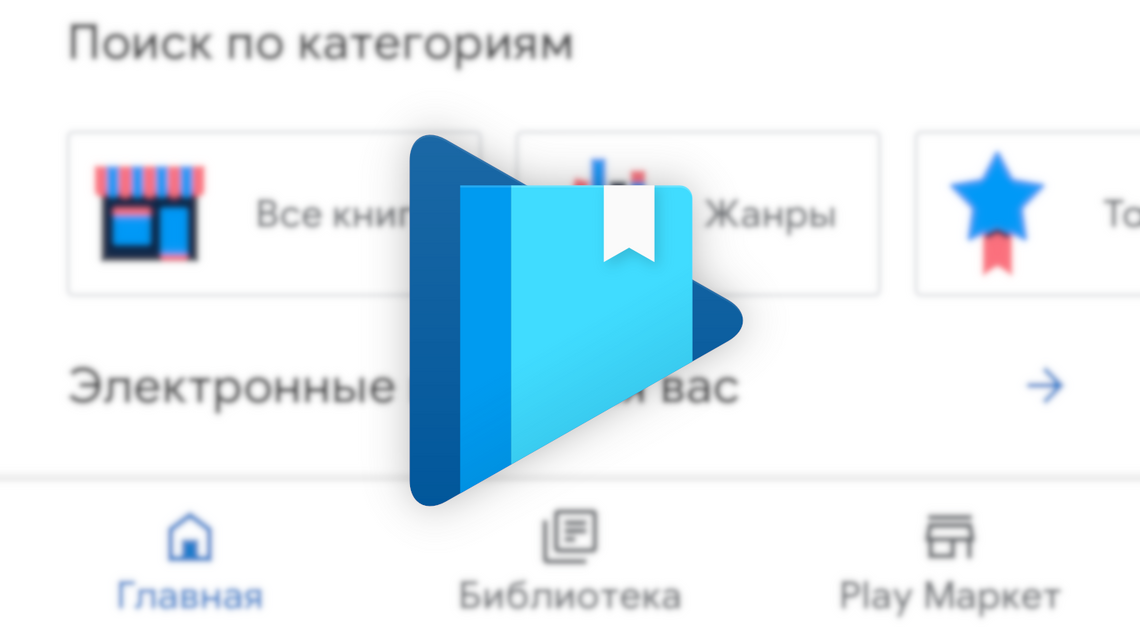
"Shop" tabs before (left) and after (right).
It remains to be seen if this is merely a difference in translation or an upcoming change, but our screenshots show the Shop tab being renamed to Play Market. We're told the Shop -> Play Market difference is a result of the regional language settings. Apart from that, it seems we're just swapping the "more" text for an arrow, and potentially getting the slightly smaller book cover previews other sections have.
Tabbed categories for eBooks and audiobooks at the top remain the same, sub-categories exchange their filled oblong buttons for outlines, and color/iconography changes match what you'd expect.
Page navigation before (left) and with the new design (right).
The overall reading experience doesn't seem like it will change too much, though the navigation/settings menu that appears on tap is subtly different. Chapter heading has been moved beneath the page preview, the page/location indicator is now to the right of the progress bar/page selector, the table of contents button is to the left of that selector, and the overall page preview looks smaller.
While most of the changes in the app are merely visual tweaks and easy to gloss over, the changes here would seem to impact usability and accessibility in a small but negative way, shrinking the size of text in some places while also decreasing the size of interactive elements — all to no user benefit. Many prefer reading eBooks specifically because they're a bit more accessible, with the option to crank font sizes while reading. It's not a substantial difference, but Google's changes here specifically conflict with that mindfulness toward accessibility.
Other changes seem to be less substantial. The settings menu, for example, is effectively unchanged, save the tweaked colors and navigation bar.
Most of these redesigns leave us either excited or indifferent, but a handful of the changes to Play Books would seem to make a minor but genuine negative impact on usability and accessibility — a choice made all the more confusing by the inherently improved accessibility that can be provided by eBooks. It's not the most drastic negative change, but every little bit helps (or hurts).
So far, we believe the change is associated with a server-side switch. Our examinations of the latest version we can find (5.0.5_RC04.227721962) don't show the redesign on our own devices, but our tipster is running the same version. As always with Google tests like these, YMMV.
Thanks: Сергей Липман