Read update
- It's official
The refreshed Material look, also known as Material theme or Material Design 2 in our circles, continues its march toward Google service domination. We've already seen it hit several apps on our phones, and its web expansion has been surprisingly rapid too. After Gmail, Google News, the Google support pages and personal account page, Android Messages, Hangouts Chat, and even the Chrome web store, now's the time for us to have a glimpse at what Translate would look like in this new design.
According to our tipster, the Google Translate page on his computer switched to this new Material look today. The new design is showing up both in Chrome and Firefox and sticks around even when he signs out and back in.
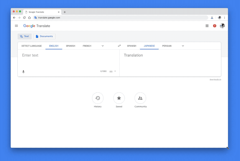
The design has all the hallmarks that we've seen recently: more white and less grey, new blue shade, more rounded corners, and Product Sans font. The two important changes seem to be the two boxes on the top that let you choose whether you're translating text/links or an uploaded document, as well as the switch from a big Translate button to a more subtle arrow.
New Google Translate web interface (above) vs current (below)
Beside that, the desktop interface now appears to look more like the mobile web one. The left side menu and three round icons for History, Saved, and Community are there on the bottom. Plus the translation boxes take the entire width of the screen.
This is a server-side update though, and none of us here at Android Police can see it yet. It's likely going to slowly roll out over the next weeks, if not months.
UPDATE: 2018/11/29 6:25am PST BY RITA EL KHOURY
It's official
The new web interface for Translate is now official. Google says it will scale responsively across display sizes and there are new language labels for saved translations that let you easily sort through them and find the one you want.
Thanks: Joery

