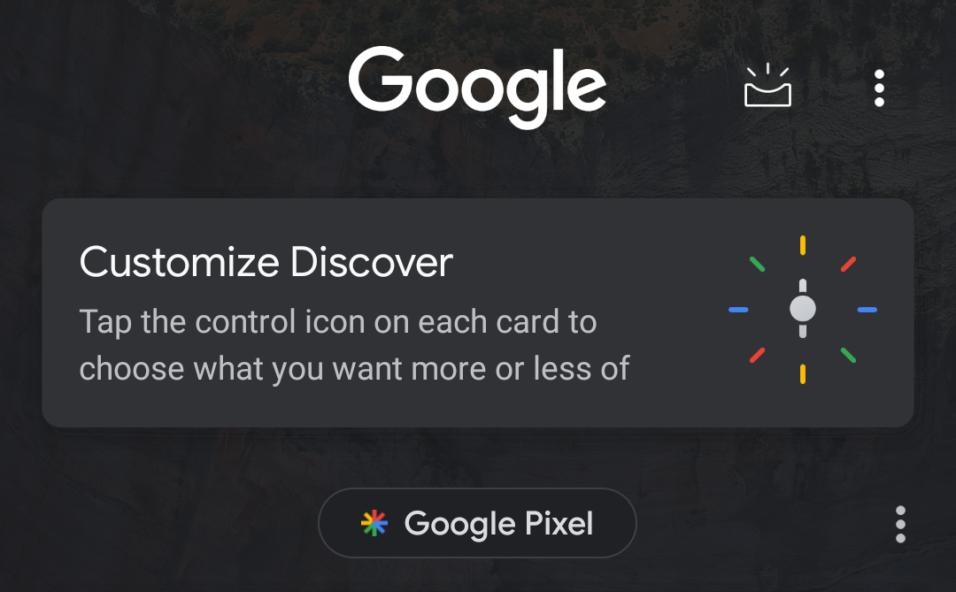
Last week, Google announced a rebranding of its Feed into Discover, tying together multiple server-side changes we had been spotting in the last year. From dividing cards with topic bubbles to having dedicated topic pages, more/less content controls, a new dark theme, and an asterisk-shaped icon, everything is there in the new update. And that new look is rolling out to more users now.
As always, these rollouts happen in batches, so don't worry if it takes days (if not weeks or months) for the new design to reach you. But when it does, you can expect to see something like the screenshots below if the dark theme is activated on your Pixel Launcher. There's also a white interface, for those who prefer a lighter color scheme like I do.
Unlike Feed, Discover's dark theme uses dark grey cards.
The new Discover is also supposed to introduce multiple language support, letting you choose which content to see in which language. The first pair supported is English and Spanish in the US, but we haven't seen signs of this yet.
Thanks: Vivek Salyankar, Vivek Dhakal, Khaled Taleb, Caleb S