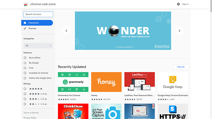
Google's web browser got a makeover with the release of Chrome 69, bringing it up to date with the search giant's current iteration of Material Design, Material Theme, informally known as Material 2.0. Now, Chrome Web Store has a new look to match.
Per the established aesthetic, there's a lot of white space and a lot of rounded edges — design elements that have proven to be contentious in our comments section and everywhere else passionate Android debate is found.

However, whether or not you like these design elements in certain Google applications, products, and services that see more day-to-day use, they make a lot of sense in a digital storefront. It provides a clean canvas that allows the colorful extension thumbnails to pop.

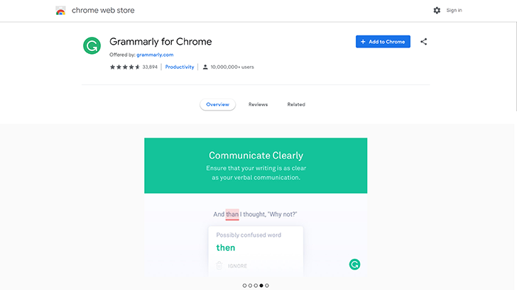
The individual extension pages, too, are incredibly sleek and professional looking, which will no doubt help bolster confidence in the store's extensions (good news for sketchy extension developers). The update comes after a slew of recent Material updates this August including makeovers for Contacts, Phone, and Google Search on desktop. No doubt we'll see more in the near future as Google matches all of its apps and services, so hopefully you like a lot of white and round corners — unless dark theming is just around the corner. We can only hope.
Thanks: Faheem Ahmad, Sushubh