Google, much like Portal's fictional Aperture Laboratories, engages in pretty much perpetual testing for... basically everything. Latest up on the A/B block is the in-app purchase interface. A handful of our readers are seeing a new dialog resting at the bottom of the screen, rather than Android's previous floating and centered confirmation.
Before (left), new interface (right).
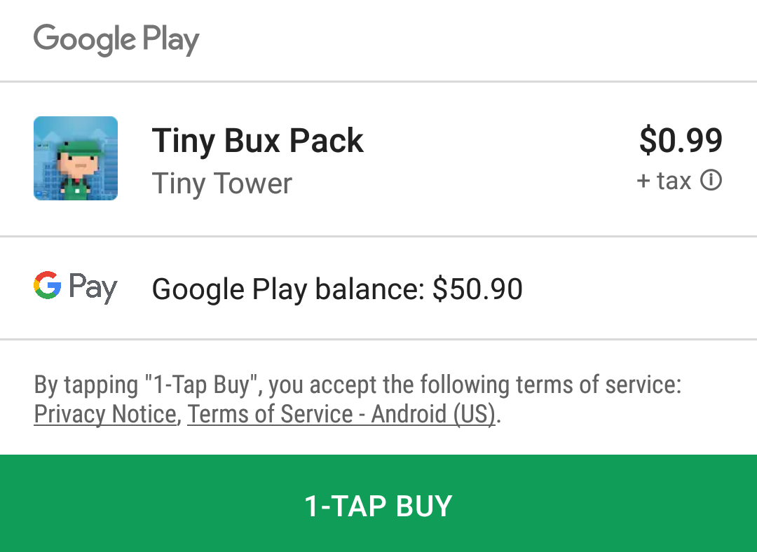
The new interface presents all the same information it previously did, with price and payment easily visible, but with greater visual separation between the pertinent details. It makes things a bit easier to parse at a glance, with an almost print receipt-style layout. The payment method has been made even more visible as well. Psychologically, that screen-spanning buy button begs to be tapped much more than the previous dinky one did.
Different ways the new interface can be used by the checkout process.
The new interface is as flexible as the previous one, based on the variety of different types of screens for the different types of checkout processes that have been spotted. Though it might consume a bit more space on your screen, the new layout does seem to be a genuine benefit to at-a-glance usability.
So far none of us have this new IAP interface, so we can't tell how it might behave outside the screenshots provided. Presumably, this change has either just started rolling out, or it's part of a limited A/B test, but we'll keep an eye out.
Thanks: Alex Batts, Nitin Kumar ,and everyone that sent this in.