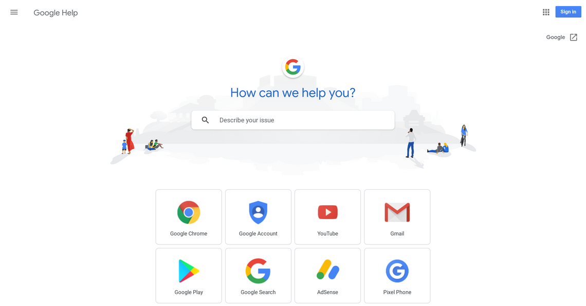
Google sure loves its negative space. Following bright refreshes of both Gmail and Google Drive earlier this year, Google Help has been overhauled with a new layout that includes way, way more white than the previous design.
The new design is admittedly handsome, and very 2018 Google. The Google Help home page layout, seen above, features a friendly greeting and pulls the search bar down from the corner and puts it front and center. Characters illustrated in a familiar, simple style surround it, with a series of icons underneath that link to support hubs for individual Google products. (That tiled icon layout is pretty similar to how it used to be.)
The newly white mobile support page.
Product support pages share the same aesthetic, with the search bar right in the middle of the page, swimming in oodles of white space. The general look is also shared by the mobile site. Personally, I'm a fan, but many have criticized the company's newfound love of bright white user interfaces.
Source: Google Help