There's really only one game in town when it comes to audiobooks, and that's Audible. That means you have to use the frustrating, awkward Audible app. It's slightly less messy today thanks to a new UI that rolled out sans app update. The new interface cuts down on the clutter and moves useful features into the main player.
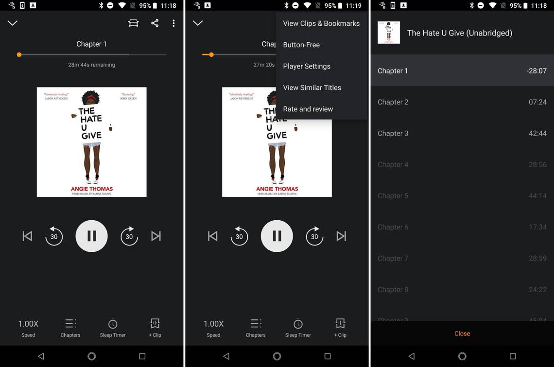
Since this update is arriving without an app update, there's no changelog to share. We do have some screens of the old interface below for comparison, though. The clunky expanding playback control bar at the bottom is gone now. Instead, you have larger buttons near the middle of the screen. The bottom is home to additional functions that used to be tucked away in menus like a sleep timer, speed control, and chapters.
The album art in the new app is a bit smaller, and it doesn't flip around to show the book info. I feel like the art could be a little larger as there is some wasted space below the playback buttons. The library and store appear to be unchanged in this update, but those have both been in flux for a while. There's just nothing new there right now.
If you're on one of the last few updates, the new interface should be automatic. The last update was in early July, and the one from June has the new look as well. Older builds still have the previous UI. The new UI is not without issues, but it seems better overall. Now, if only Audible could fix location syncing.
The old look.
Thanks: Daniel