A couple of months ago, we reported that Twitter was testing a bottom navigation bar in its Android app. This came as no surprise since many apps from Google and others have been following this UI trend in response to the ever-increasing size of our smartphones. Twitter has now announced, on Twitter, that the test is over and the bottom navigation bar is here to stay.
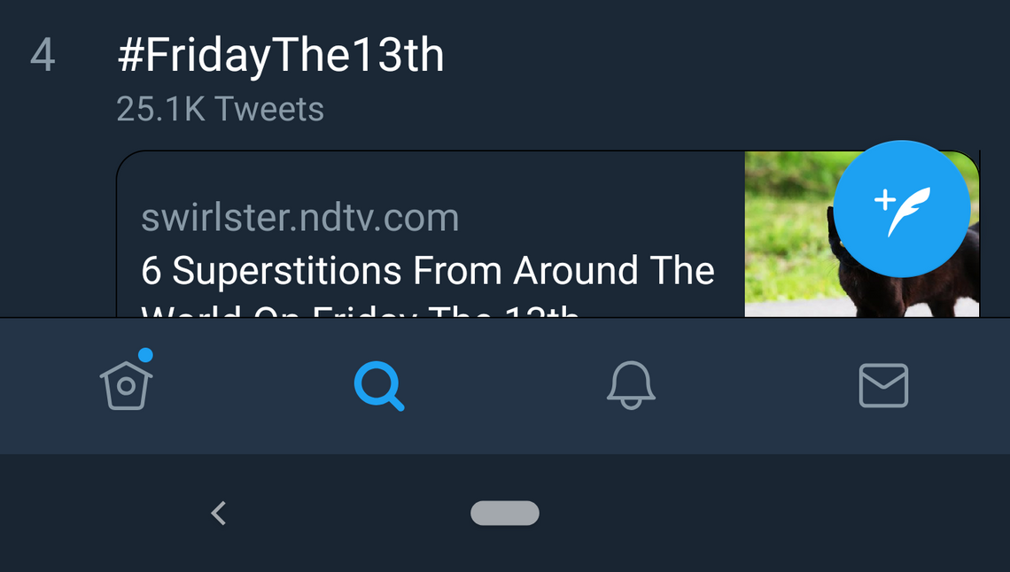
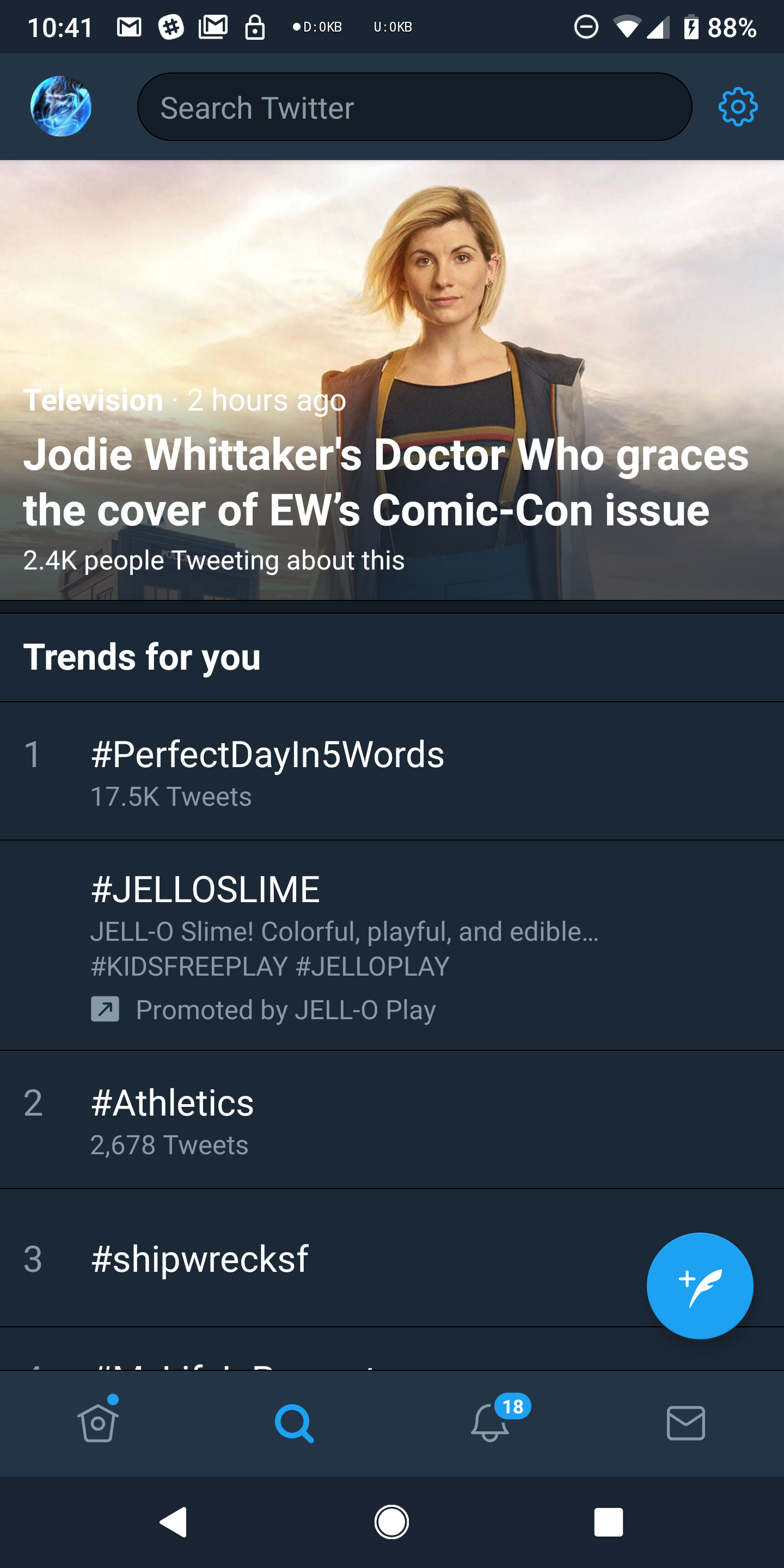
It's a relatively simple change, on the face of it, that really just takes the four options from the top bar — Home, Search, Notifications, and Messages — and moves them to the very bottom of the screen. This makes it so much easier and more comfortable to reach those buttons with your thumb.


Before: Top nav bar. After: Bottom nav bar, yay!
There are other less important tweaks, such as the sizing of the search box and a new settings cog in the top right of the search screen that used to be an icon for adding contacts, but the rest of the app is unchanged. The UI in my Twitter app switched while I was writing this without any update to the app via the Play Store, so we're looking at a server-side switch. It shouldn't be too long until it reaches your device too.
Source: Twitter