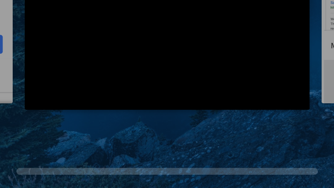
One of the most divisive (read: generally disliked) features in Android P is the new gesture navigation system, which brings all the convenience of unintuitive, non-descriptive interface elements together with precisely none of the visual space-savings you'd expect to gain from gestures. The latest Android DP4/Beta 3 tweaks the pill-based app switcher a bit, stretching the track for the slider to fill the full width of your screen and expanding app previews to be a lot bigger.
App switcher and gesture slider in DP3 (left) and DP4 (right).
You'll notice that there's no actual slider present in the gesture-based app switcher for DP4; the "pill" is nowhere to be seen. That's because, with this new tweak, there is no pill in the sliding app switcher. In Stephen's words, "your finger is the slider." I hope all your minds are appropriately blown.
The sliding area for switching between apps fills the entire bottom of the screen now and provides 6 haptic stops where app previews are cycled (with the left and right-most still serving to slowly scroll between apps), compared to 5 closely-cramped stops in the previous implementation.
Previews are also much larger now. Previously, the size for app previews stayed consistent, not changing sizes as you switched between the gesture app-switcher and the single-pull pill view. Now, it expands immediately to the larger size pictured above to the right once you start sliding by grabbing the pill—though manually scrolling through the list of apps present in non-gesture view works the same as before, with a smaller preview.
Thanks: Ramit Suri

