Google Chrome's Canary build offers "bleeding edge" features so they can be tested ahead of possible graduation to the more stable versions of the app. Recently, Google has been experimenting with the traditional top-positioned toolbar in response to ever taller Android handsets, first by moving the whole thing to the bottom (Chrome Home), and then by replacing that with a swiping up gesture to access the new tab page (Chrome Duplex).
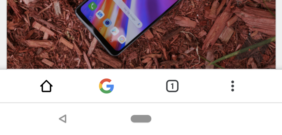
The latest evolution of this test — controlled by the #enable-chrome-duplex flag in chrome://flags — introduces a brand new bottom toolbar that exactly mirrors the options at the top of the screen. There's a home button, a Google 'G' that allows you to type in the Omnibox, a tab switcher, and an overflow menu. Since the URL field itself isn't recreated, the buttons are evenly spaced in the bottom bar, although this isn't exactly visually pleasing since it breaks the overall symmetry when compared to the top toolbar.
Left: Chrome Home. Right: The original Chrome Duplex.
Below: The new Duplex UI.
When you scroll down a webpage, both top and bottom toolbars disappear until you scroll upwards again, giving you a distraction-free view of whatever you're browsing. The bottom overflow menu on the bottom toolbar still animates as though it originates top right, but it does move further down the screen so that it ends over the three dots that you tapped.
There doesn't appear to be too much more to the new Chrome Duplex, although we can probably expect further changes as Google tries to perfect it. I would personally rather see the entire toolbar just at the bottom, as was the case with Chrome Home, so I hope that will return at some point (even as a separate flag) — why not give us the choice, Google?
Thanks: qqppaallzzmm