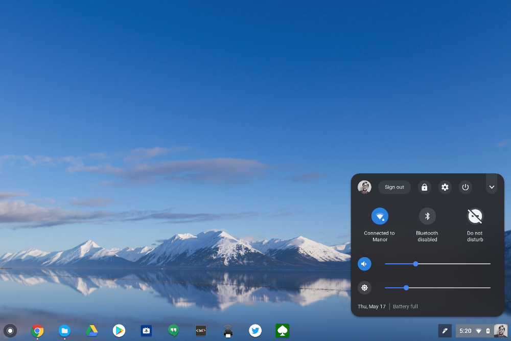
Chrome OS is getting a revamped, dark-themed system tray inspired by Android P. The more modern design is part of Google’s effort to bring Chrome OS and Android closer together in terms of their appearance. You can try it out now if you’re on the Chrome OS developer or beta channels.
We got our first glimpse at the revamped system tray back in March, when it first appeared for those running the Chrome OS dev channel. It has since received a bit more polish and is now available on the beta channel, too, which suggests its debut in a stable build could be imminent.
The new tray, just like Android P’s quick settings panel, sports a dark background with white text and icons. Inactive toggles are grayed out, while those that are active are highlighted blue. An arrow in the top-right corner of the tray opens a new compact view, which displays your primary toggles only.

This darker theme only appears inside Android P when users have the dark mode enabled, otherwise it is white by default. It’s not yet clear whether Chrome OS will have a lighter option once the redesign makes its way into a stable build. For now, the new look must be activated manually when running the latest dev or beta builds. You can do this by following the steps below.
- Type “chrome://flags/” into Chrome’s address bar and hit return
- Enable “#enable-system-tray-unified”
The new look could still change before it rolls out to everyone, but that seems unlikely given that Google is pushing to make Chrome OS and Android more alike. And again, the redesign has been available on the dev channel for a little while now, so Google appears to have decided on it already.
Source: Reddit
Via: About Chromebooks