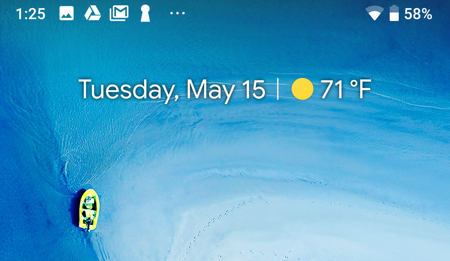
There are many controversial UI decisions in the Android P developer preview, many of which appear to be geared toward phones with screen notches. One interesting quirk is a definite lack of icons up in the status bar. Android P only shows four notification icons, but Oreo shows many more.
As we saw in the first dev preview, Google moved the clock over to the left side of the status bar. It takes some time to adjust to that, but it gets weirder when you add notifications. Even on the current Pixels with their un-notched screens, you only get four notification icons in the status bar. After that, the phone displays some dots. If you want to see more notifications, you'll have to open the full notification shade. On Oreo, phones will show you around seven notification icons in the status bar before running out of space.
The number of dots in the status bar won't tell you what apps have notifications, but they might clue you into how many there are. After you hit four, you can get between one and three dots. With five total items, you have four icons and a single dot, with six you have two dots, and with seven or more there are three dots. The result is that the top center of the screen is unused, which makes room for a notch.
It's unclear if this feature will be the default for Android P when it's released. it might only be this way in the dev preview so people can get used to the way things will appear on phones with screen notches.

