As Google prepares to sunset Play Music in favor of a new subscription model for YouTube Music, some changes to the app are being made to bring it in line with its competitors. A new fullscreen player UI is rolling out, along with a queue feature similar to Play Music that lets you line up subsequent songs and change the order at will.
A Redditor with version 2.27.53 of the YouTube Music app discovered these new additions, although since it doesn't appear to be widespread it's likely Google is merely testing ahead of a future update. As you can see from the comparison below, the new player looks much more polished. By taking up the whole screen, it's able to make the player controls larger and the album art more prominent.
Left: The old player with next songs below. Center and right: The new player and expanded queue.
Instead of displaying an uneditable list of the next songs to be played, the redesign includes a section at the bottom showing the next song and the playlist you're currently in. There's a small upward arrow on the right side that brings up the queue (above right). Unlike before, you can now change the order of what's coming up. It's very much like functionality we see in Play Music, Spotify, and others — exactly what YouTube Music needs if it's to replace Play Music as Google's premium music subscription service.
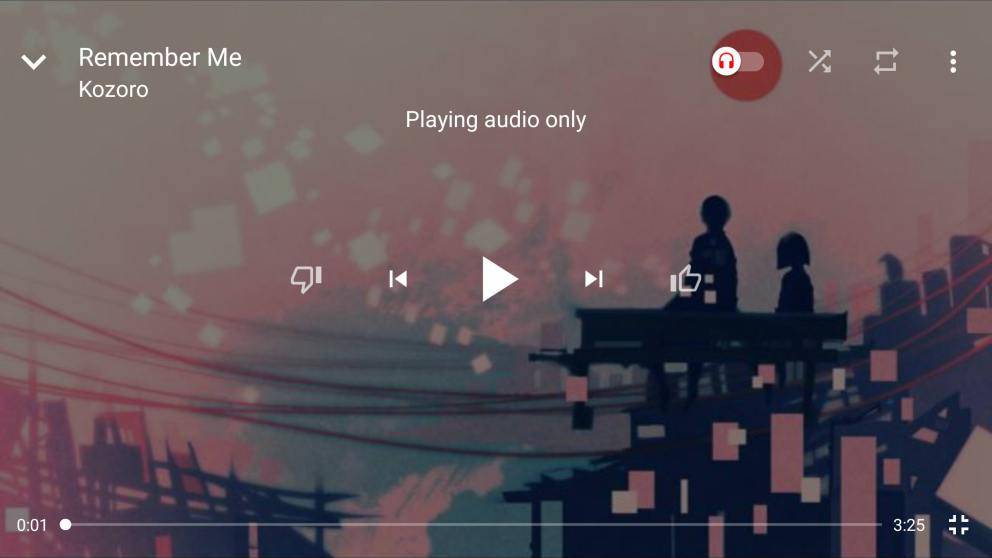
Above: Old fullscreen player. Below: New fullscreen player.
In landscape, a fullscreen player is displayed (above), and this has also been modernized with a fresh design and rearrangement of the buttons. To show us how it all fits together, the original poster on Reddit created the below gif.
It's unclear how many people will be part of this A/B test. Let us know if you're one of the lucky few to get the new interface.
Source: Reddit
Via: 9to5Google