Google's been updating a ton of its services with new looks recently, including the modern new Gmail UI that landed earlier today. But this year's spring cleaning isn't just about refreshing things for consumers. Developers are also getting a bit of love. Google has just updated its Android Developer site with a new design.
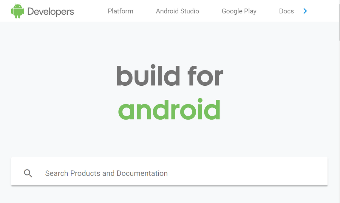
The new site homepage (above) compared to the old design (below).
The new design is white, it's bright, and it's loaded with white space. Overall, it matches the refreshed "Material Design 2" we've seen in Chrome and Gmail.
Gone is the old nested, branching navigation on the left side of the page. It's been replaced with a single five-category bar up top. As you navigate through each basic category, additional navigational options appear as tabs in a sub-group bar below.
The change is more than just homepage deep. Every navigable page has these changes, so far as I can tell. And it appears that it isn't just a stylistic difference, either. Some pages have been removed, moved, or restructured entirely. Developers may want to double check that their bookmarks still point where they like, as some pages like the old "Develop" section have been wholly replaced (though redirects are in place)
New "Docs" section (left), vs old "Develop" section (right).
Some sections, like the Sample code navigator, are almost entirely unmodified in the new look. Yet others, like the Package Index, have the barest minimum of changes to fit with the updated aesthetic. YMMV when it comes to individual pages.
So far as I can tell, nothing is missing. At most, things have been restructured or moved. Again, thankfully Google does seem to have redirects in place for changes. I'm not a developer, though, and there are a ton of individual pages. If there are any specific parts of the documentation provided on the Android Developers site which you rely upon, it is probably a good idea to check that they're still there in some form you can recognize.
Source: Android Developers