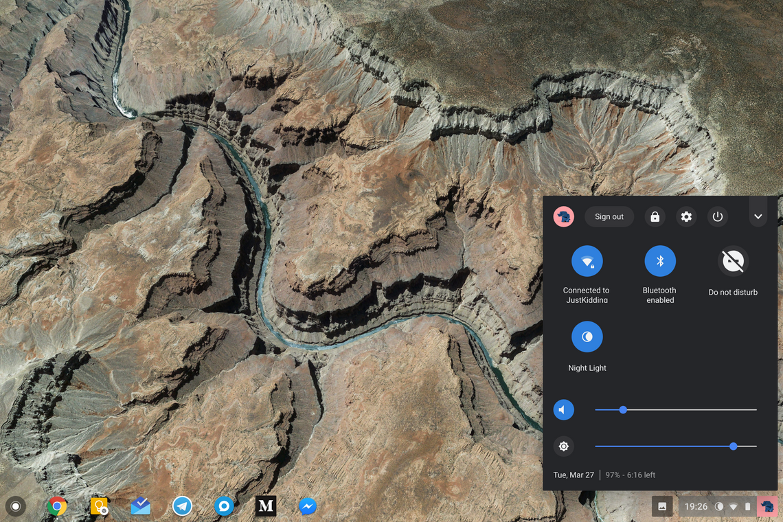
The first developer preview of Android P was released earlier this month, and some of the most noticeable visual changes were to be found in the quick settings panel. Icons are now placed inside circles which are blue if active/on and greyed out if inactive/off. It's too early to say for sure if these changes will remain the same in the final version, but if Chrome OS 67 is anything to go by, they may be pretty much final.
The latest version of Google's desktop, laptop, and now tablet OS introduces a new style for its quick settings panel, and it's clear the design teams within Google are working together to create a unified look. With Android P in dark mode (set a dark wallpaper) the similarities are more pronounced, although it's not yet clear if Chrome OS 67 has a corresponding light mode.
Left: Android P. Right: Chrome OS 67.
To get the new quick settings tray you'll need to be on the dev channel for Chrome OS with the following flag enabled: #enable-system-tray-unified. This means Google is still testing the design out, so it's subject to change ahead of reaching the stable channel or being enabled by default.
The rounded design and color palette are both very similar, and this homogeny can be seen as a further step towards a more consistent experience across Google's two major operating systems. This makes even more sense now that Chrome OS tablets are a thing, as the new interface looks much more touch-friendly. I expect we'll see even more design unification across Google products moving forward, and that can only be a good thing.
Source: Reddit