Google Search results go through design iterations faster than you go through underwear... or maybe pajamas. Every few days, there's a new layout, some new colors, different shaped buttons or cards, or other changes happening to search results, but this latest one is more about the function than the form. Instead of loading results in a paginated manner, some users are seeing a button to see more search hits on the same page.
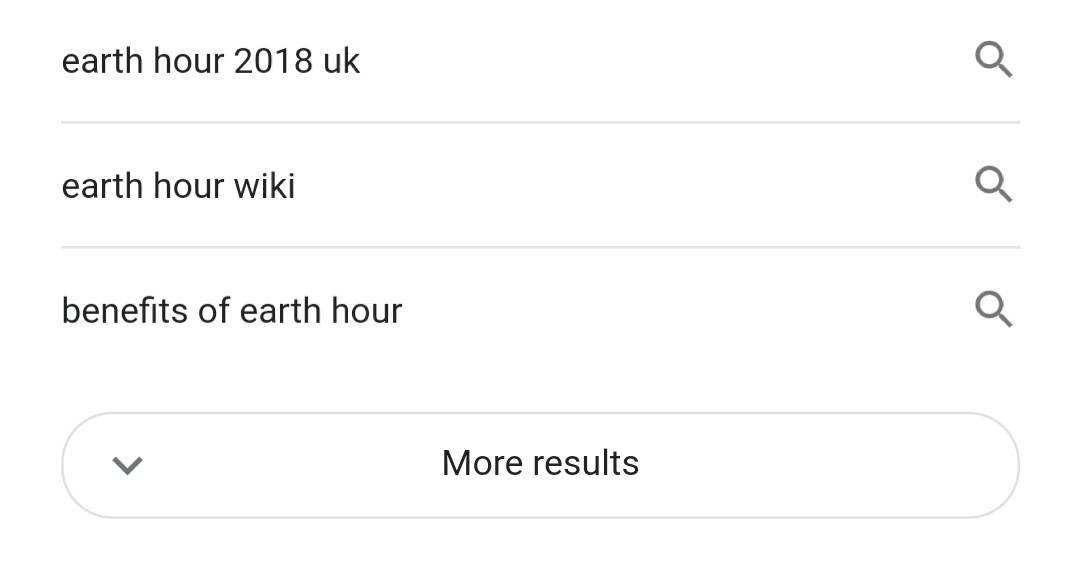
Up until now, the bottom of Google's search results displayed related terms (when available) then a Next button that jumps to the next results on a new page. If you're part of the server-side test, however, you'll get instead a More results button that loads the next results right there on the same page, no need to wait for another page to open up.
What I see at the bottom of search results (left) vs. what our tipster sees (right).
You can keep scrolling down and getting more of these as you go. All the results from the first one to the last are on the same page, so it's easy to go back up and down the list and check if you missed something.
When "More results" is tapped, the next search results show up right below the existing ones.
A little dive in the UX rabbit hole told us that this design interaction is commonly referred to as "load more", whereas the old one is called "pagination." Both are thankfully better than "infinite scroll" (where the next parts are loaded automatically), since you can stop and load at will.
Thanks: Ajay Meemrot, Anonymous