It's very rare to see Google improve the tablet experience on Android. As the Play Store arrives on more and more Chromebooks, perhaps someone at the company realized the app's tablet UI could use some tweaking. A new layout for app pages has been rolling out to users that adds a little more color.
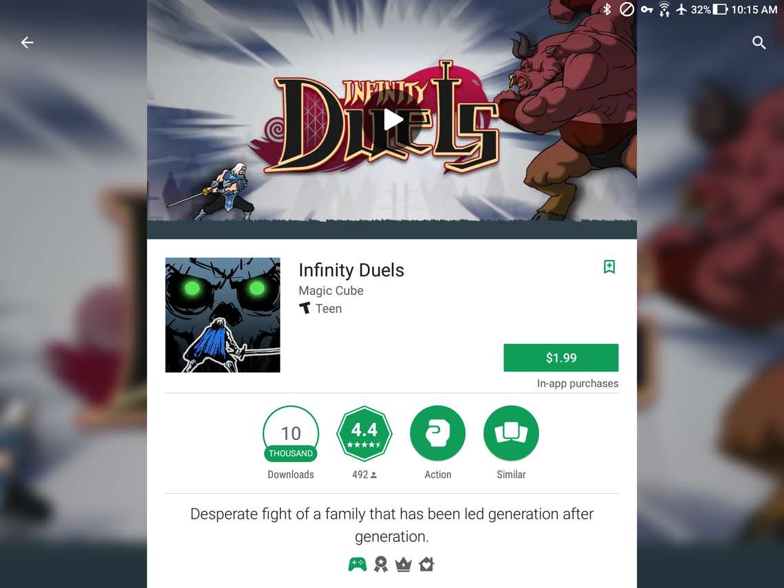
Previously, an app page on the Play Store would stretch the image/video banner at the top to fit the width of the screen, with the rest of the background being gray. You can see what the old design looked like in this video. Now, the top banner is the same width as the main content, with the background being a blurred version of the banner image or video thumbnail.
While the new layout is a bit prettier, it still feels like a downgrade from the multi-column layout that the Play Store had on tablets several years ago. Maybe one day, we'll get that back.
Thanks: Chris, Daniel