Google's custom Nexus/Pixel dialer has added a few cool features over the years like local search and video call integration, but the interface hasn't changed in ages. Today, it looks like Google is testing a redesign that moves your tabs to the bottom. This isn't always a surefire way to improve app usability, but I think it works here.
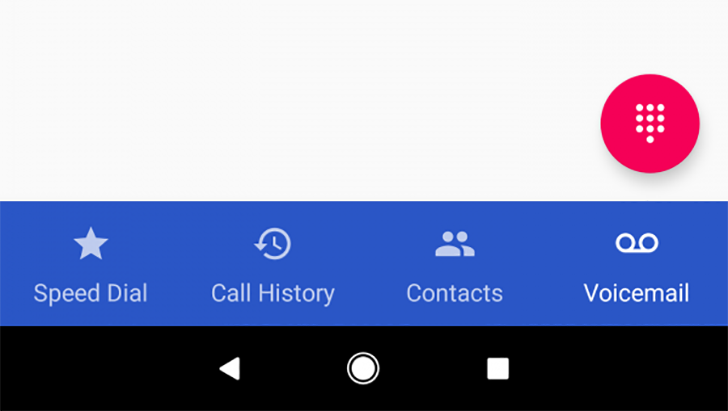
In the new version, the same four tabs you've long had in the dialer are still there. However, they're at the bottom of the app. Instead of just being icons, they've got text labels as well. There's Speed Dial, Call History, Contacts, and Voicemail (with carrier support). Since you're often operating the dialer with one hand, it makes sense to have buttons at the bottom where they're more easily accessed.
Left: old UI, Right: New UI
The new UI is apparently already buried in the latest version of the app. XDA has instructions on how to coax it out of hiding, but you'll need to mess around with XML file mods. As with all of Google's experimental app revamps, this one might never see the light of day, or it could roll out to all eligible Nexus and Pixel phones. We'll have to wait and see.
Source: XDA