Icons can either make an operating system look very modern or very dated. You could have the most state-of-the-art OS, but the wrong icon will make that OS seem like it's straight out of 1995. Google knows this, and so it's updated all of its system apps and iconless apps to show a new, contemporary-looking icon.
1, 2: The current default icon. 3, 4: DP4's default icon.
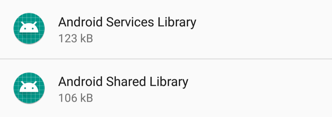
The last icon that was used for all apps without icons was a green one that depicted the top part of an Android mascot's body, and it launched with either Lollipop or Marshmallow. It looked somewhat modern, but also a bit cartoonish. The new icon, however, fixes that issue. This one portrays an Android's head atop a teal cutting mat. The difference in appearance is due to different adaptive icon shapes; Pixel devices get circular backgrounds, while the Nexuses get square ones. It's worth noting that this isn't the same thing as the Android System icon, which was changed last year and remains the same in Android O.
left: DP3. right: DP4.
Expect to see this new cutting mat bugdroid in your settings app very soon. You might also see it if you download some old, random app from the Play Store, but I'd advise against that.
Thanks: Nilanjan