Thanks to the magic of A/B server-side tests, Google can try hundreds of different layouts for its apps and services and compare results between them. And the company's engineers are seriously taking advantage of that to check the influence of any design and option combination that they can think of. (Sidenote: this has made our lives hell at Android Police. The number of tips we get about changes we've already covered, the number of times we have to quadruple check something is new, the confusion over whether something is rolling out to everyone or just some people, the guessing game over whether it's a new app version feature or a server-side switch... ughhhh... Bad Google, bad!) But I digress...
One area where Google is trying a lot of things lately is the Google app and its associated mobile search results page. And the latest test brings together some elements from previous design layouts. We've already seen the results cards with 4 colored dots, we've also seen a colorless UI where the URL and page title get inverted, here's a refresher:
Two previous Google Search results page test layouts: 4 dots (left) and colorless (right).
But now there's another test that combines and expands on both. And it looks good... putting aside the weird rounded-card-on-top-of-rounded-card look of those Twitter results.
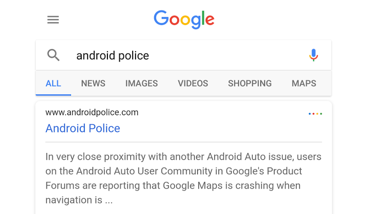
As you can see from the comparison screenshot below, the new layout dumps the green color, switches to a lesser purple blue, rounds the corners of the result cards, inverts the placement of the page title and URL, and adds the 4 mysterious colored dots.
Left: What seems to be the current default Google Search results layout. Right: The new layout.
Here are a few other comparison screenshots based on another tip we received:
New above, old/current below.
Putting aside the terrible large font or small resolution of the second set of screenshots, I do like the look of this one. The page titles, which are often the first thing I look at, clearly stand out in blue. Plus, the entire design looks more modern and in line with Google's current color choices and designs, but without being as sterile as the colorless layout I saw last month. However, I'm still going to be puzzled by the 4 dots. Why are they there? Is there a hidden meaning to them? Why do they exist if they do nothing?
Still, I don't think I'd be consternated if this ended up being the new official Google Search results layout, and I might even quickly grow to enjoy it. What do you think?
Thanks: +Davide Avogadri, Samo Miklavc, Liam Haynes, Colin