Sharing photos with friends and family is one of the best social things you can do with your phone, so it only makes sense that it should be as seamless as possible. Google has been putting a lot of work into the sharing experience in its Photos for the last year, and the latest evolution of the interface just started appearing for some users today. If you try sharing one or more photos, you may be greeted by a new screen with a carousel-like photo picker.
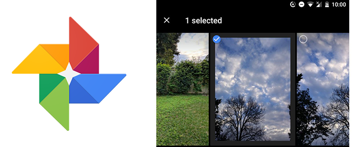
Left: Old interface. Right: New interface. – Thanks, Philip.
After selecting a photo to share, the new picker screen makes it easy to scroll through other photos taken around the same time. Tap to mark them with a check and they'll be added to the list when you finally hit Send. This doesn't really change any capabilities for sharing, but it means you don't necessarily have to choose all of your photos up-front. But more than that, this is just more aesthetically pleasing than the old hovering card interface.
So far, the new sharing UI seems to be on a pretty limited release as most of us don't have it yet. It's possible this is rolling out to everybody shortly, or it may only be available to select users while it is being tested and fine-tuned.
There's also a share target called "Family group" appearing in the list that may be new for most people. Tapping on it will automatically select members of your family group to be shared to, but you can still deselect people and add new ones if you like. This was mentioned during Google I/O and some people have reportedly had it for a few weeks, but it may be going live for many more now. This still isn't the automatic sharing feature that was mentioned during the keynote, but it's cutting out some taps when you want to share with those close to you.
Thanks: Philip Chang