We've had the same dark/teal color combo in the notification panel for years now with few complaints, but someone at Google decided it was time to change things up a bit. Android O's second developer preview has made the quick settings' theme grayscale, and rearranged/redesigned some smaller aspects of the notification panel in general.
left: Android 7.1 Nougat, right: Android O DP2
The new, lighter theme is the most eye-catching change here. The darkish-teal look first debuted with the Android L developer preview, and it's persisted until now. Given how many people dislike apps with predominantly white backgrounds, this will no doubt be a controversial decision.
left: Android 7.1 Nougat, right: Android O DP2
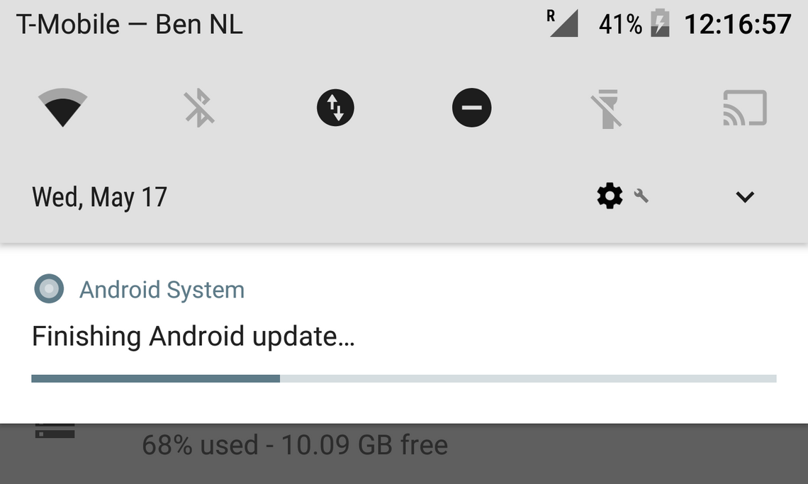
Moving on to the smaller things, there are some other slight changes in DP2 as well. While opening the quick settings previously showed the time and date on the top left and the settings and expand buttons on the top right, DP2 shows your carrier at the top left and your signal, battery, and time on the top right. The date, settings button, and expand button have all been relocated to below the quick settings. When the quick settings are expanded, the profile and edit icons go below the quick settings alongside the settings and expand buttons.
The little down-facing arrow that indicates you can make a quick setting take up the entire expanded panel has made a return, and can be seen to the side of the WiFi, Bluetooth, and priority mode icons. Also worth noting is that the mobile data has transitioned into a more handsome circular icon.
The grayscale theme looks to be prominent in the settings app too. Angry commenters, commence your ranting!