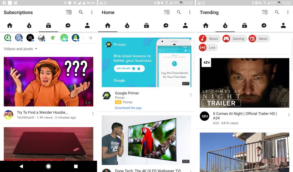
Have you been hoping for a YouTube app that would more effectively sear your retinas when you open it in a dark room? Well, Google appears to be testing a new UI that will do just that. Multiple people are seeing a new YouTube app interface that drops the red elements, going for an all black and white look.
You can see some examples of the new interface above. It's got a very clean, high-contrast vibe, but that makes the YouTube Red service seem rather oddly named, doesn't it? YouTube has used a red accent color for ages so I'm not sure that I particularly like this new direction, but maybe it'll grow on me.
We've been getting reports of this color swap for a few weeks in relation to Google's test of a bottom navigation bar in the YouTube app (see above). However, the new wave of white UI tests seem to all have the traditional top bar layout. It's not clear what Google is doing, but there's at least a good chance the red in YouTube could be going away.
Via: +Sebastian Lundgren
Thanks: Rakshit, xiaoya-er, Vyom, and everyone else