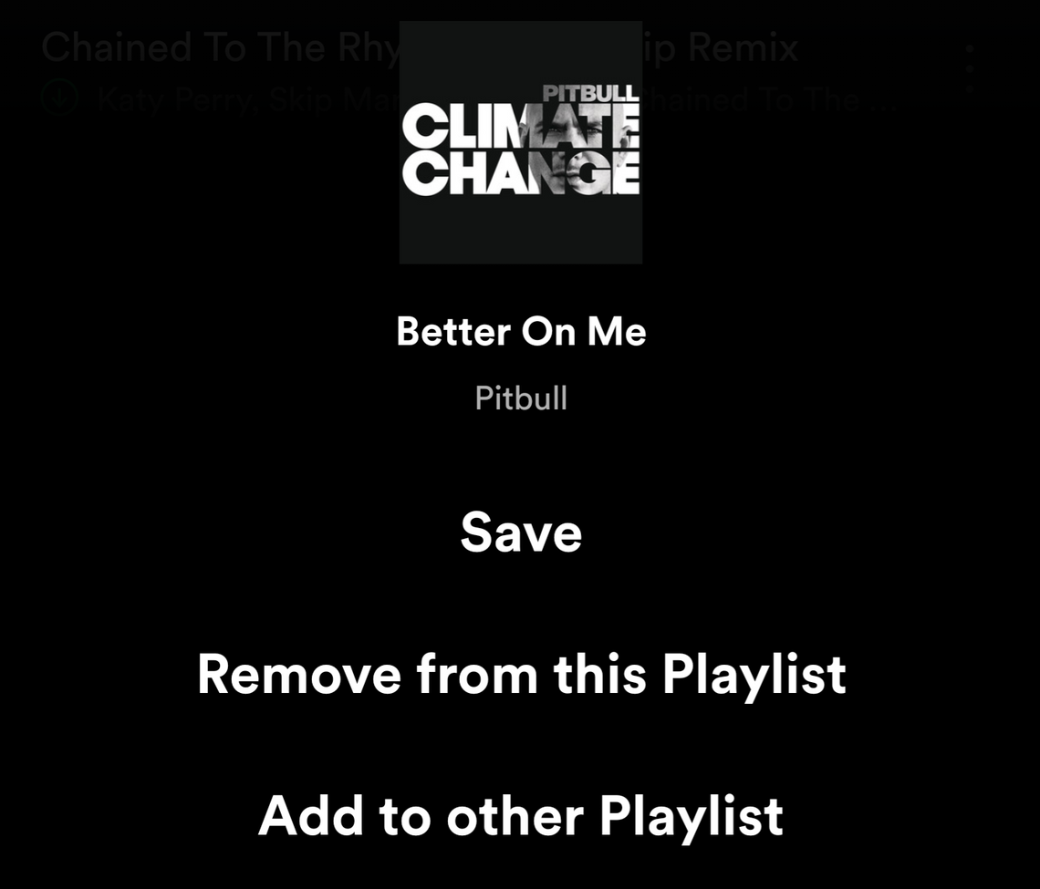
Some Spotify users have started seeing a new style for the contextual menu that shows up when you tap the overflow button next to a song or album or playlist. The menu used to appear in the middle of the screen and offer the album art plus a list of different options along with their icons. Now, it's a black overlay on the entire screen, with a much larger album art and text font, but no icons. There is no functionality change, only a visual one.
Current Spotify overflow menu (left) and the new one being tested (right).
Not all options are immediately visible either. The first 4 will show up easily but you will have to scroll to reveal the rest. It looks a lot more cumbersome in my opinion and the lack of icons makes the list more difficult to parse visually. Plus, sharing, launching the radio, and exploring the artist or album are now less accessible.
Scrolling to reveal the rest of the options.
This layout is showing up for users on both the stable and beta versions of Spotify, so it does look to be a server-side test. Personally, I hope this one doesn't stick, or at least that it's improved before being rolled out to everyone.