The Play Store team is killing us. Over the past couple of months, we've seen so many server-side tests for interface changes that we've lost track of them all, and which ones are official and which ones are still not available to everyone. Just today we discussed a significant improvement that could have apps and games show up separately on the Store, and now we're back with another change.
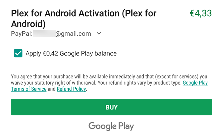
The in-app purchase dialog, the one that pops-up whenever you tap on a paid item inside an app or game, might be getting an overhaul soon. Instead of the old pop-up window showing up in the middle of the screen, this new IAP menu covers the bottom of the display and uses the Play Store's new shade of green along with a big Buy button akin to the new wide buttons in app listings on the Store.
As with all server-side updates, this one also doesn't seem to be live for everyone just yet. Neither Artem nor I can see it now. But it does look more suited with the Play Store's new design so I wouldn't be surprised to see it spread to everyone soon.
Thanks: Ibrahim Al-Alali

