Consider this one just a shadow of a whisper of a rumor, folks, but a recent video posted by Google indicates that at least someone in Mountain View is considering some major changes for the Play Store app. Take a gander at this Pixel Tips support video. Most of it is fairly obvious stuff meant for first-time users (perhaps including some of those iPhone owners that Google is so keen to convert), but at around the 1:40 mark the demonstrator opens the Play Store, and it's immediately clear that it's not the same one we have right now.
Old above, new below.
The very first look at the store is different, with a clearer, more focused home screen dispensing with the top banner "carousel" and the quick links to "top charts" and other sub-categories. The individual listings for apps themselves look a lot cleaner as well: Note that the "Install" button now spans nearly the entire width of the screen, and category information and the "similar" button are gone to focus on the review score and number of downloads. Everything gets a slightly more minty shade of green, too.
These two brief looks at the Play Store don't necessarily indicate a hefty redesign. It could be that whoever created the support video at Google didn't have easy access to the Play Store and simply mocked up the images... but the presence of search and animation makes that less likely. It's also possible that this is part of an internal testing build that won't make it out to users at large. Google tweaks its apps more or less constantly, as we saw earlier this month - note that the "Entertainment" section removed in those screenshots is present here. We'll keep an eye out for more changes either way.
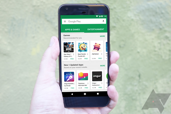
For the record, the image at the top of this article is just a mock-up - we haven't actually seen the new Play Store UI on the Pixel or any other physical device. It's just that those vertical screenshots don't make a nice header.
Thanks: David Stanton