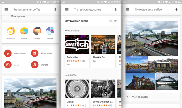
Android users (or at least the ones who read this site) love a good beta, because it means that they get to check out all the new bells and whistles before anyone else. So it goes with the beta version of Google Maps. Multiple readers tell us they're seeing a new user interface when opening Google Maps' Explore menu, which is an alternate view for finding local businesses and attractions. The new look, which is heavy on Google Now-style cards, is above. Compare it to the current version (on the standard non-beta app) below.
This seems to be a server-side change, because just having the beta version of the app installed isn't enough to see the new version of Explore. That's not uncommon with Google apps, but the rollout seems to be so limited that we really couldn't say if the new version of the Explore page will stick or not.
There's nothing particularly bad about the older version with the blue tabs at the top of the UI, but the new all-white version seems to be better integrated with other Google services like Photos. The new version also ditches the tabs for a longer vertical scroll, which might make it easier to quickly parse info on the go. We'll have to wait and see if it actually makes it into the standard version of the app.
Thanks: Ben, Miguel
[EMBED_APP]https://play.google.com/store/apps/details?id=com.google.android.apps.maps[/EMBED_APP]