YouTube's Android app seems to be getting yet another design revamp, this time in the form of a navigation change. This news comes just a few weeks after it was reported that the YouTube app is getting a new UI for comments and video descriptions (which many people, including myself, still don't have).


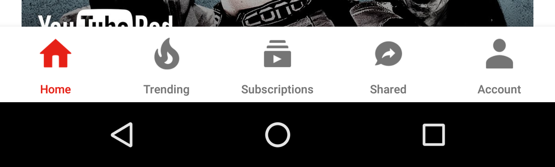
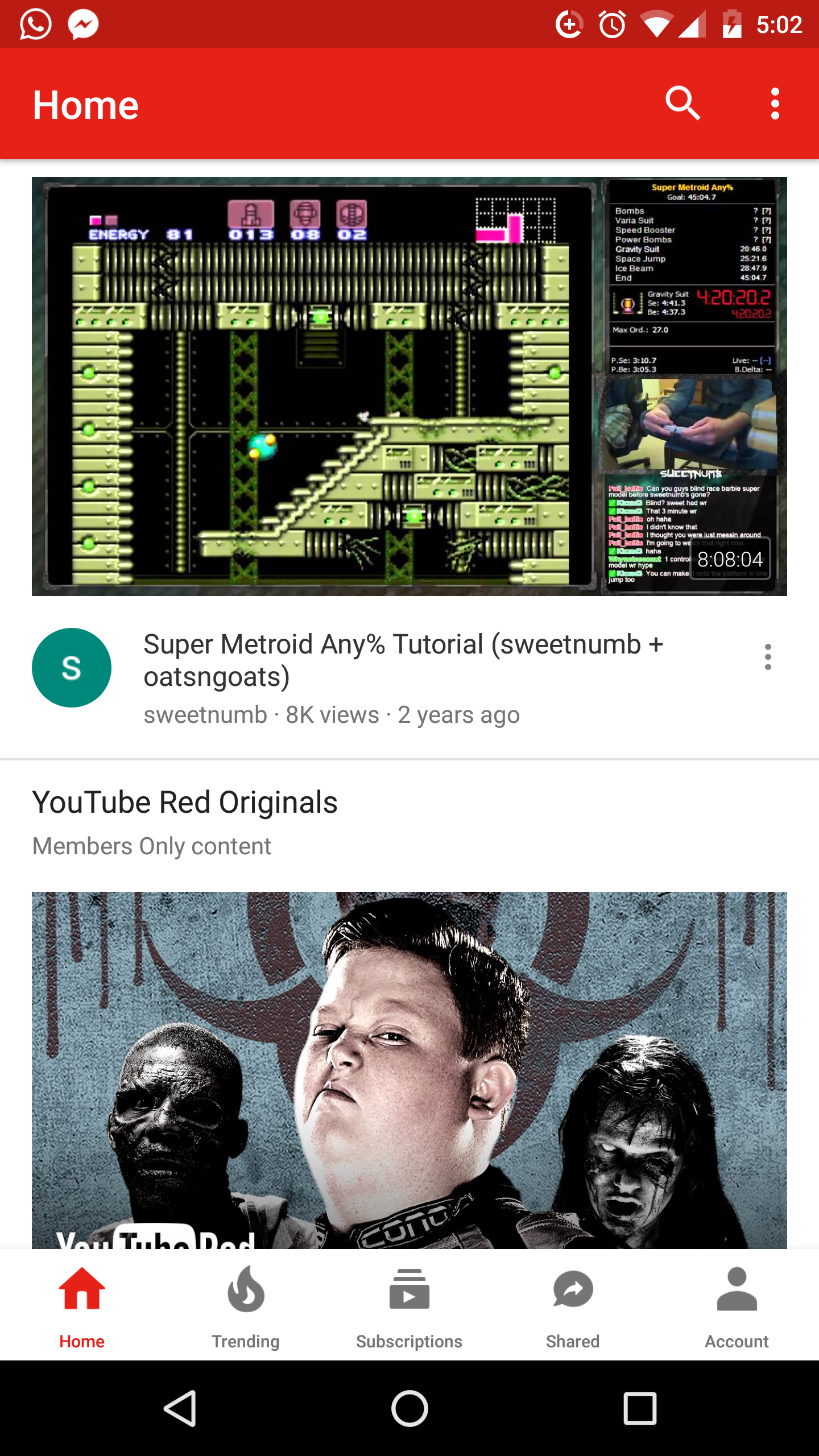
left: the current layout. right: the new layout.
In case you somehow haven't noticed the difference even after reading the title and looking at the attached screenshots, this server-side update relocates the navigation bar from the top of the app to the bottom. In addition, the bar changes from having a red background with a white tab indicator to having a white background with a red indicator. However, the order of the buttons has not been adjusted. It is currently unclear if users with this new nav bar already had the "Shared" tab and if they also have the new comments UI. Users will not gain the "Shared" tab in this update if they did not previously have it, but the comments UI update does seem to be bundled in.
There will no doubt be naysayers who whine about this change, either because they don't like the appearance or because it makes the app look like it's from iOS, but I personally welcome it. Even though I don't have small hands (insert Trump joke here), I almost always have to shift my grip on smartphones to reach the tabs. Having the bar on the bottom may not make the app prettier, but it sure as hell improves functionality. And isn't that what an app is all about?
Thanks: Alex, Wilkings