After reading that title, you may already be thinking to yourself "but Google already changed the Allo and Duo icons once, didn't they?" And yes, they did, around two months ago. Those icons were, to put it gently, dull. To put it less than gently? They kind of sucked. I can't think of a single app on the Play Store published by Google that incorporates the product wordmark into the icon aside from Android Pay and Google+, and the latter is arguable. (Edit: upon closer inspection, the Google On app does, too.)
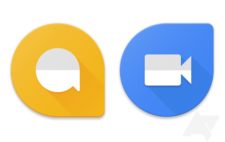
And regardless of exceptions, the rule for Google products is clearly that the app icon should be illustrative, not textual. As such, the current Allo and Duo icons you see on the Play Store are... problematic.
Do you want those in your app drawer? Me neither, particularly. And simply removing the wordmark portions of those icons would make them look terribly generic. So the new versions, as you can see at the top of this post, are far more in line with the design language Google has modernly used in its app iconography.
As to when Allo and Duo will launch? We still don't know, sadly. But it can't be too much longer, can it? (I'm asking. I don't know.)
And because we always feel a responsibility to disclaim: these app icons could change before Allo and Duo actually launch. Given they've already changed once, it's an entirely reasonable possibility that the teams could decide to switch things up again before the apps go public. We just can't know. We do feel confident that our information here is quite recent and we are extremely confident in its authenticity (i.e., this rumor would score a "10/10" confidence). But Google is notorious for last-minute changes, so I wouldn't call these a "sure thing" by default.