I don't like this recent trend of using bottom navigation bars. Not because it is reminiscent of iOS apps, but because I have gotten so used to sliding a navigation drawer from the side that reaching the bottom of my phone's screen is just not engrained in my muscle memory. Also, the way it's implemented often uses screen estate that can be better utilized to display more data than to provide switches to other tabs that I may not need or use all the time. But that's just my opinion.
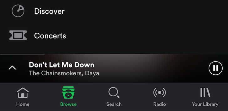
It looks like the bottom navigation panel or bottom bar or whatever you want to call it is here to stay. Google+ and Google Photos use it, the Material spec was updated to officially mention it, and now Spotify has decided to test out a bottom bar in its latest beta. Gone is the side sliding menu and instead you get these 5 icons at the bottom of the screen to take you through to the home page, browsing, search, radio, and your library.
The major side effect is that the now playing bar gets raised on top of it, which means that you may need to readjust if you're used to tapping that pause button often.
There are a few other interface changes in this beta too, like different redesigned elements and more, but this is the most striking UX modification. You can join the official beta program by following the steps here and hoping to get an invite to join. Otherwise, just grab v5.9 beta from APK Mirror.
Thanks: Kamran Mackey