An official name for Android N isn't the only change that Google made to its public face today. In addition, there are a handful of updated pages for major Android-related websites within the Google universe — for some reason the dedicated page for Android One is gone. Why Google felt the need to get rid of a page explaining its biggest developing world mobile push is a matter of speculation, but it surely doesn't bode well for the low-cost phone program.
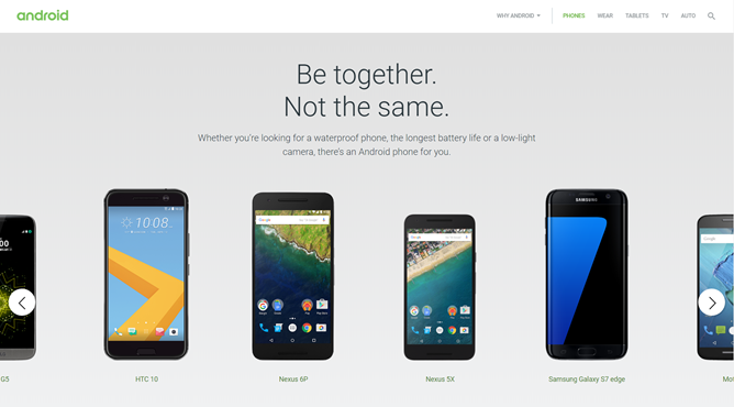
The biggest change is probably the main Android portal itself at android.com/phones. Before today it used a grid layout to demonstrate some of the finer points of the latest Nexus phones, plus the flagships from Samsung, LG, and HTC. Now it starts with a carousel of some of those same devices, but as users scroll down they're treated to a cavalcade of notable features. The scroll-heavy design is a pretty common one - you could call it "Apple-inspired" if you were feeling lazy, but it's not as if nearly every consumer electronics manufacturer isn't trying some variation on this theme at the moment. Here's a look at the difference via the Internet Archive.
Old on the left, new on the right.
Most of the other portals on Android.com have been updated with the same carousel plus features look. Here's a before and after for Android tablets...
Android Auto...
Android TV...
Android Pay, which actually seems less like the new design...
And the Google Play featured page.
Most of the changes riff on Google's "be together, not the same" slogan in one way or another. Expect a new slew of changes (and perhaps a couple of cuts to the lineup) the next time there's a big shift in the world of Android.