Pop quiz, developers: how do you piss off the maximum amount of users and ruin the reputation of your years-old utility app at the same time? Short of plastering racial slurs all over the intro screen, hiding semi-useless adware inside it seems like a pretty good bet. Though the developers of ES File Explorer eventually turned off the sneaky "charging boost" app that was included in some of the latest builds, the perceived damage to the app among dedicated users has been done. That said, ES File Explorer has over 100 million installations, so things are moving forward regardless.
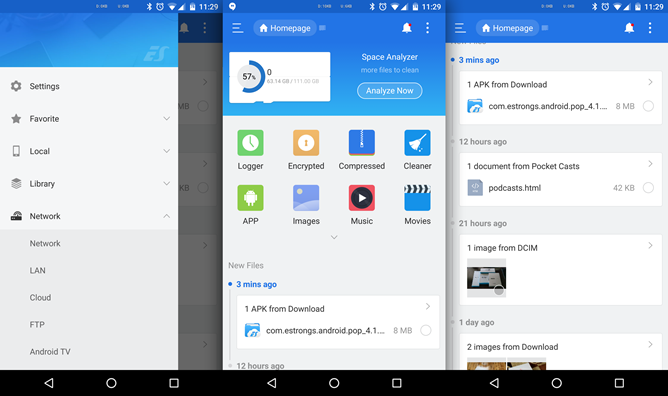
Version 4.1 includes a major overhaul of ES File Explorer's user interface. The homepage has been given a striking layout reshuffle, focusing on a more easy-to-see breakdown of the device's used and available space. There are more shortcuts to the various included tools in ES, and a "New Files" view that's visible as users scroll down. This is fairly handy - since I often open a file explorer app to access something I just downloaded, it makes sense to put all that information on the first screen.
Other changes include no more toggles in the slide-out settings menu, a more vibrant blue theme, and a more information-dense layout for the Apps screen. Version 4.1 doesn't seem to be rolling out to everyone on the Play Store just yet (there's no mention of it in the changelog), so if you'd like access to the latest changes without a wait, it's available as a manual download over on APK Mirror.