Times are a-changin', and so is YouTube's Home on both Android and iOS. It's not quite equivalent to moving houses; more redecorating, giving things a lick of paint where the wallpaper has got a little tatty.
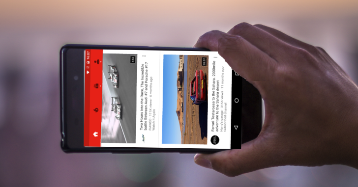
The most noticeable change is videos are getting bigger. Instead of the small, thumbnail-like videos of the past, the video preview now takes up almost the entire width of the screen. This means that fewer videos can now fit in a single scroll - on my Nexus 6P, the old layout could fit six previews, just about, whereas the new design can only fit a measly two. I don't really understand why this is better - surely if a user can see more videos, they're more likely to watch something and therefore see an ad, making YouTube more money in the process.
Left: previous layout. Right: new layout.
Alongside this change, video recommendations are getting a bit smarter, with the feed more personalized to your tastes. This is based on "deep neural technology", according to YouTube's blog post on the matter, which learns more about you the more it recommends. I've always found YouTube's recommendations a bit lacklustre, recommending a video because I watched a similar video a few days ago or insisting I watch a particular video. I'm looking forward to seeing if the updated engine is any better.
The changes are live now and in the process of rolling out globally, so if you're not seeing them, sit tight, it's not far out.
Source: YouTube blog